Essays marked with a microscope icon have been approved for
publication by peer review.
Cite this Page
Chicago
Munk, Jurjen. “II. The Coloured Edges of De Stijl: A
Conservator’s Perspective on Artworks by Cornelis van Eesteren
and Theo van Doesburg.” In
Materia: Journal of Technical Art History (Issue
5). San Diego: Materia, 2025.
http://materiajournal.com/essay_munk/.
MLA
Munk, Jurjen. “II. The Coloured Edges of De Stijl: A
Conservator’s Perspective on Artworks by Cornelis van Eesteren
and Theo van Doesburg.”
Materia: Journal of Technical Art History (Issue
5), Materia, 2025, http://materiajournal.com/essay_munk/.
Accessed DD Mon. YYYY.
II.
The Coloured Edges of De Stijl: A Conservator’s Perspective on
Artworks by Cornelis van Eesteren and Theo van Doesburg
Jurjen Munk
This article explores how a conservator’s material
perspective offers new insights into nine mounted floor
plans created between 1923 and 1925 by architect Cornelis
van Eesteren and artist Theo van Doesburg, a founder of De
Stijl (1917–1931). These plans were designed for three
architectural projects: Maison d’Artiste (1923), Maison
Particulière (1923), and Hôtel Particulier(1923), and were
first exhibited at Galerie L’Effort Moderne in Paris in
1923. A technical analysis conducted by conservation studio
RNA – restauratie nijhoff asser during conservation
treatments of the Theo van Doesburg Collection at Het Nieuwe
Instituut in Rotterdam (Disclosing Architecture 2017–2022)
revealed the significance of the coloured frames. These
frames, initially overlooked, were found to be contemporary
to the works and crucial to Van Doesburg and Van Eesteren’s
early efforts to integrate painting and architecture. The
study reveals how colour unified the three projects while
highlighting their incomplete nature. It also examines the
division of labour between Van Doesburg and Van Eesteren,
emphasising the significance of material construction and
differences between the original plans and their greyscale
reproductions through analysis of exhibition history,
provenance, and archival materials. Ultimately, the study
offers a deeper understanding of the architectural projects
and their transformation into works of art within the
context of De Stijl’s artistic ideals.
*This article has been approved for publication by peer
review.
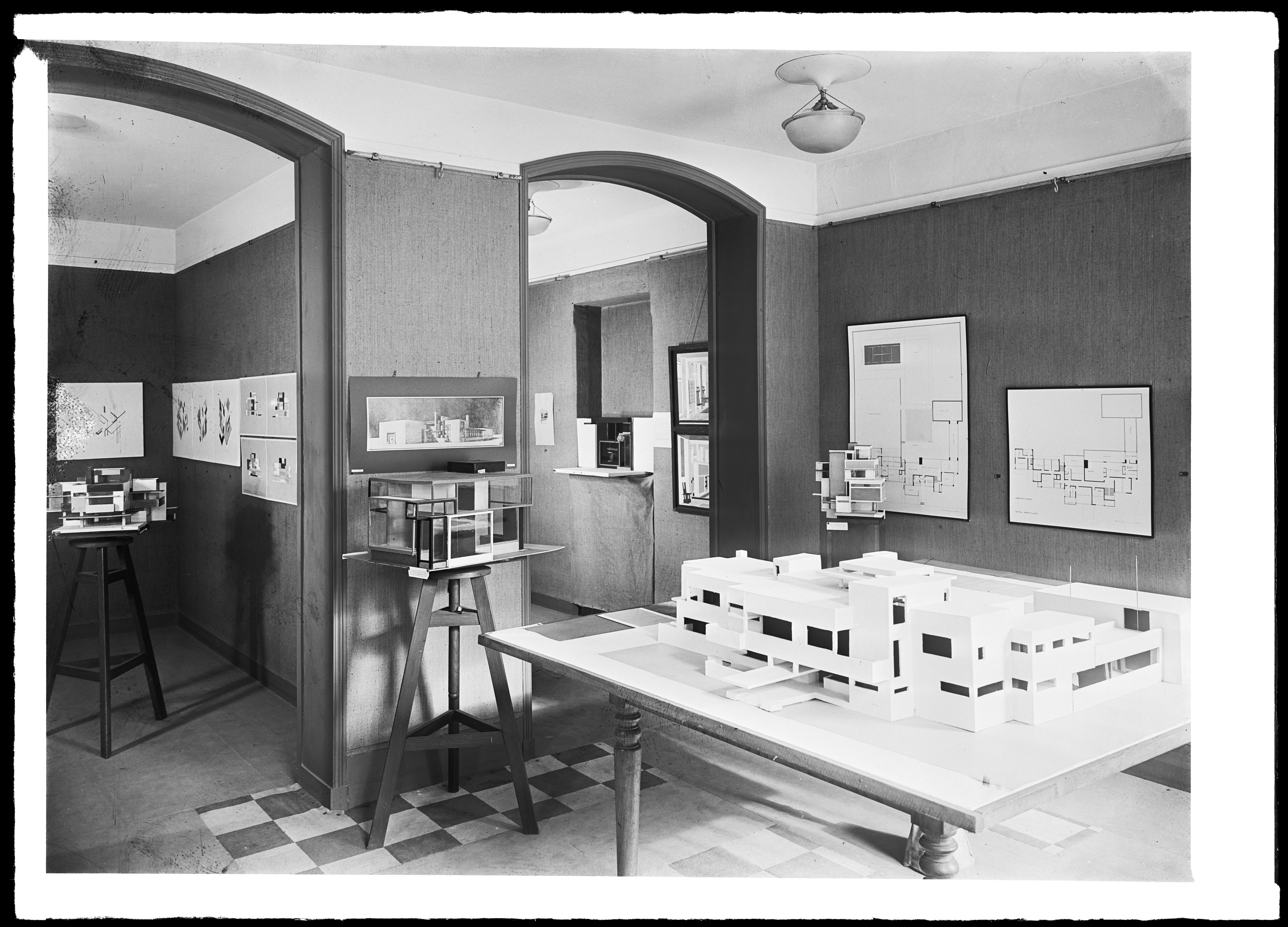
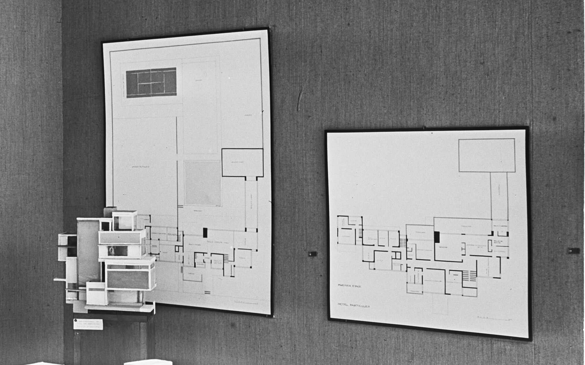
ExpandFig. 1Photo of the exhibition De Stijl, Galerie
l’Effort Moderne, Paris 1923. On the wall, the floor plans
of the ground floor and first floor of Hôtel Particulier
are visible (Collectie Nieuwe Instituut/EEST,
3.360n1).
Introduction
The conservation studio RNA – restauratie nijhoff asser in
Amsterdam was given the opportunity to work on the Theo Van
Doesburg Collection at the architecture and design archive Het
Nieuwe Instituut (HNI) in Rotterdam as part of the institute’s
conservation project “Architectuur Dichterbij” (Disclosing
Architecture 2017–22).1
The collection consists of around 450 drawings and
architectural plans by members of the art movement De Stijl,
including works by Theo van Doesburg (1883–1931), Nelly van
Moorsel (1899–1975), Cornelis van Eesteren (1897–1988), and
Gerrit Rietveld (1888–1964). De Stijl was an influential Dutch
collective of artists and architects who published a journal
with the same name from 1917 to 1932. Internationally, De
Stijl is often described as neoplasticism, and the movement is
best known for including painters Piet Mondriaan, Vilmos
Huszár, and Bart van der Leck and architects Rietveld, Robert
van ‘t Hoff, and J. J. P. Oud. Theo van Doesburg founded the
journal and the movement, and remained a strong advocate for
the views and art of the collective until his death.
The large-scale conservation project on the Van Doesburg
Collection offered the RNA conservation team the opportunity
to conduct a comprehensive analysis and gain a deeper
understanding of the collection’s materiality, as well as the
craft practices of the artists and architects who contributed
to it. Paper conservators interpret the Van Doesburg
Collection first and foremost through a material and technical
perspective—a perspective that has gained greater prominence
in art historical discourse over the past decades. As this
article demonstrates, the conservator’s eye can offer valuable
new insights into aspects of the history of artworks that
might be overlooked by historians less familiar with
materiality.
While working on the objects in the Van Doesburg Collection,
nine floor plans began to stand out, both in terms of their
material appearance and their treatment. At first sight, they
appear to be typical architectural greyscale layouts for three
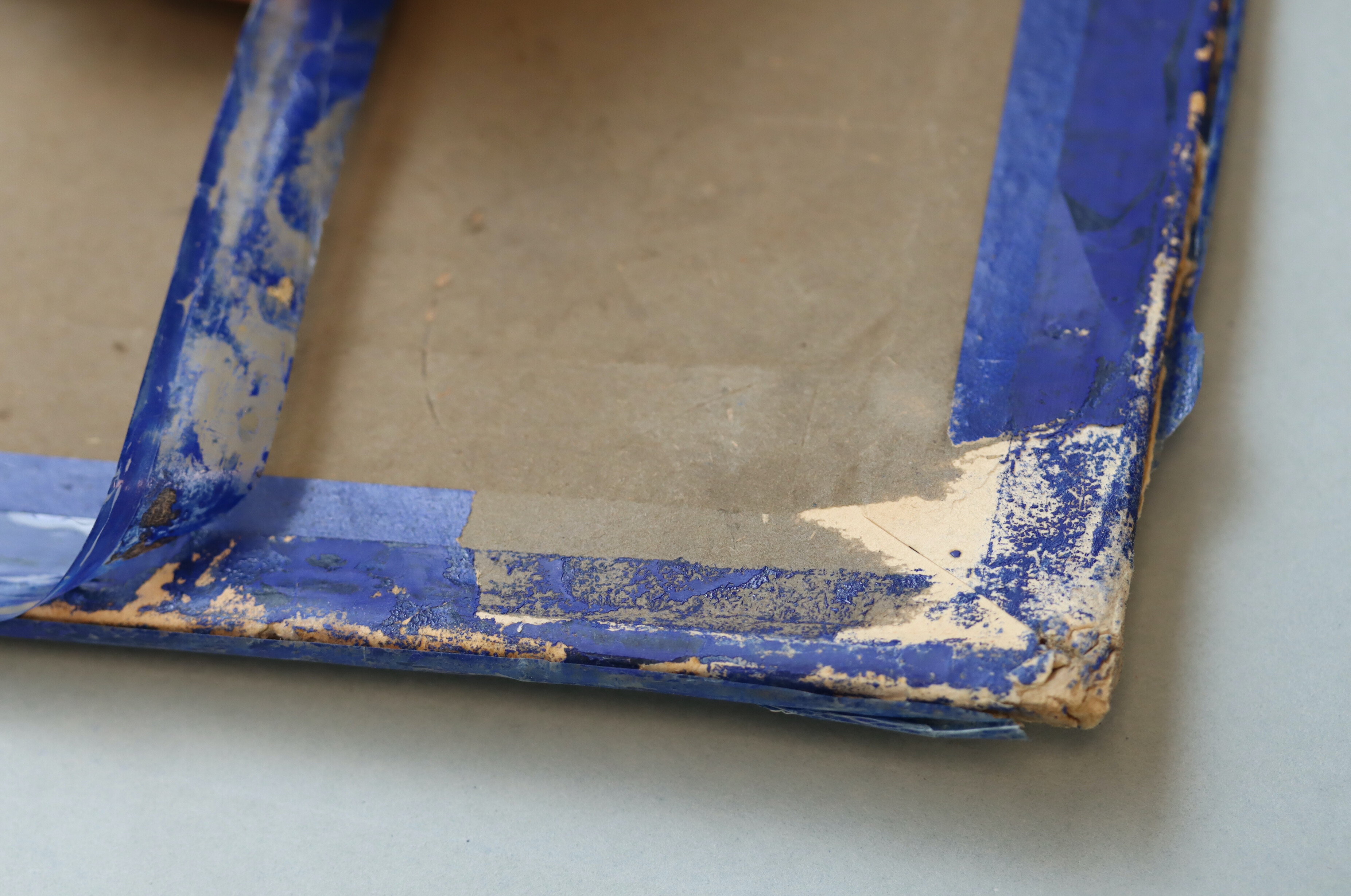
separate buildings. However, in the way they were constructed,
mounted, and decorated with coloured frames, the floor plans
form a set separate from the other 441 designs. Besides their
appearance, the floor plans caught the conservators’ attention
because their coloured frames posed an ethical treatment
dilemma. Some of the coloured frames consist of multiple
layers of coloured pressure-sensitive tape, while others are
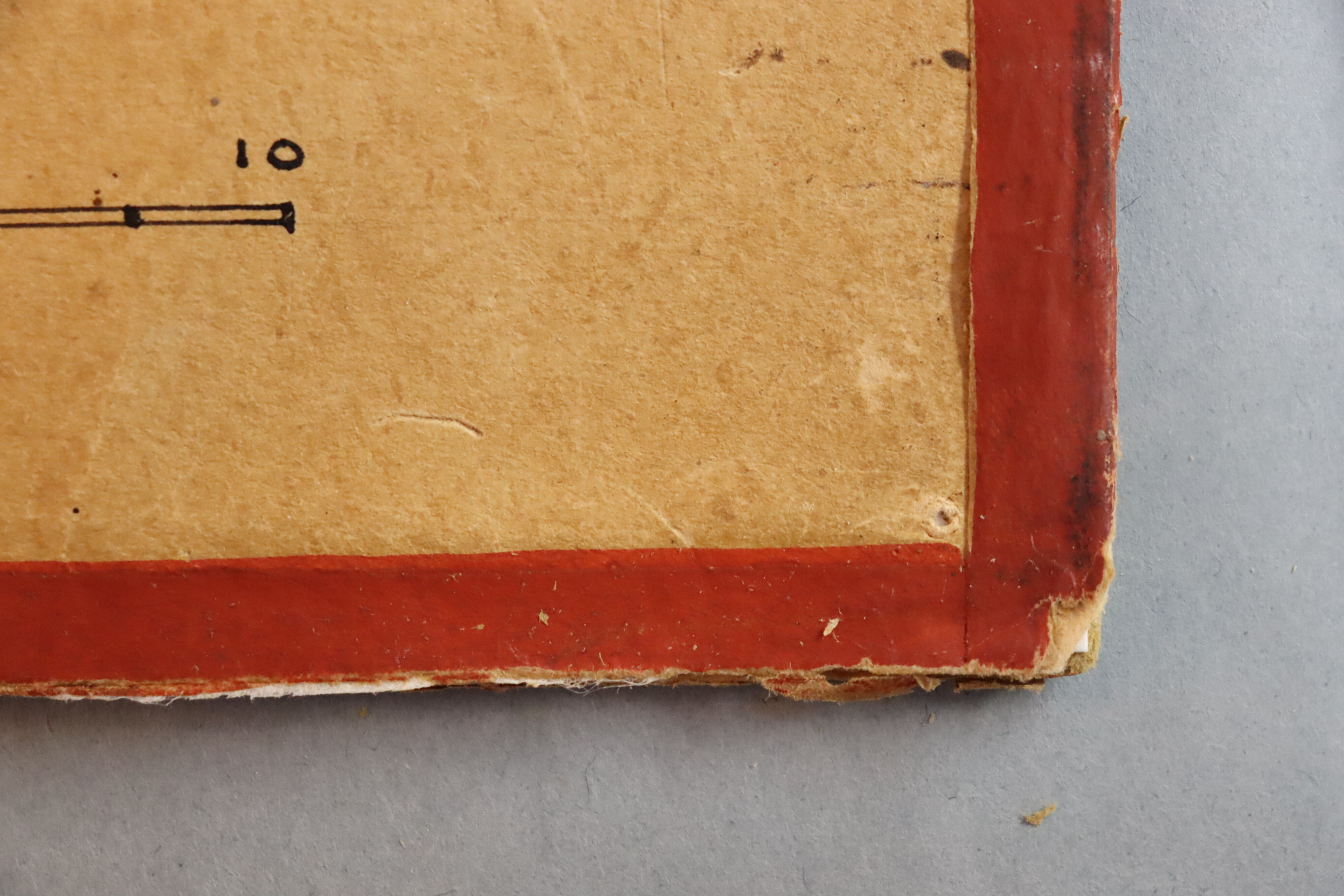
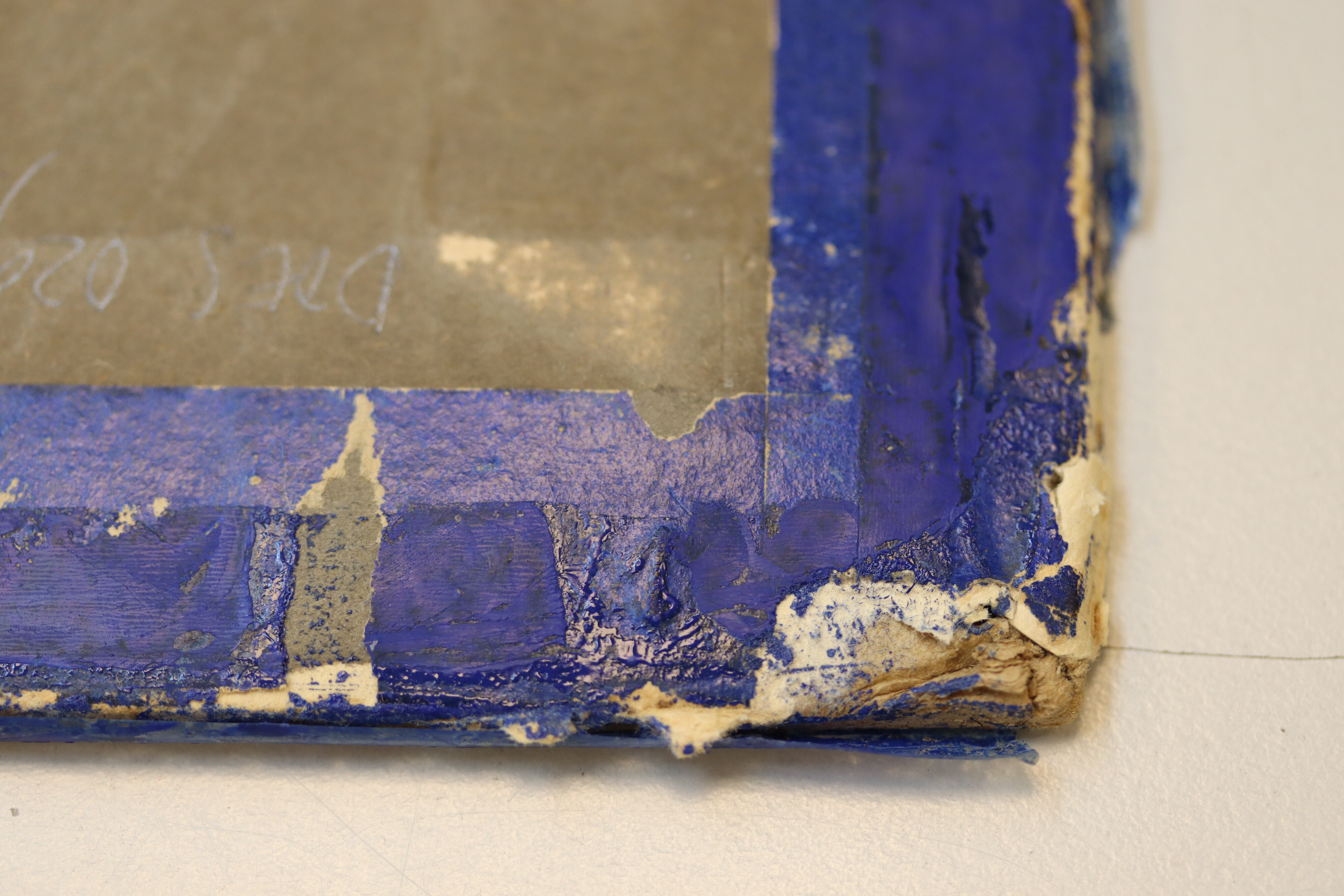
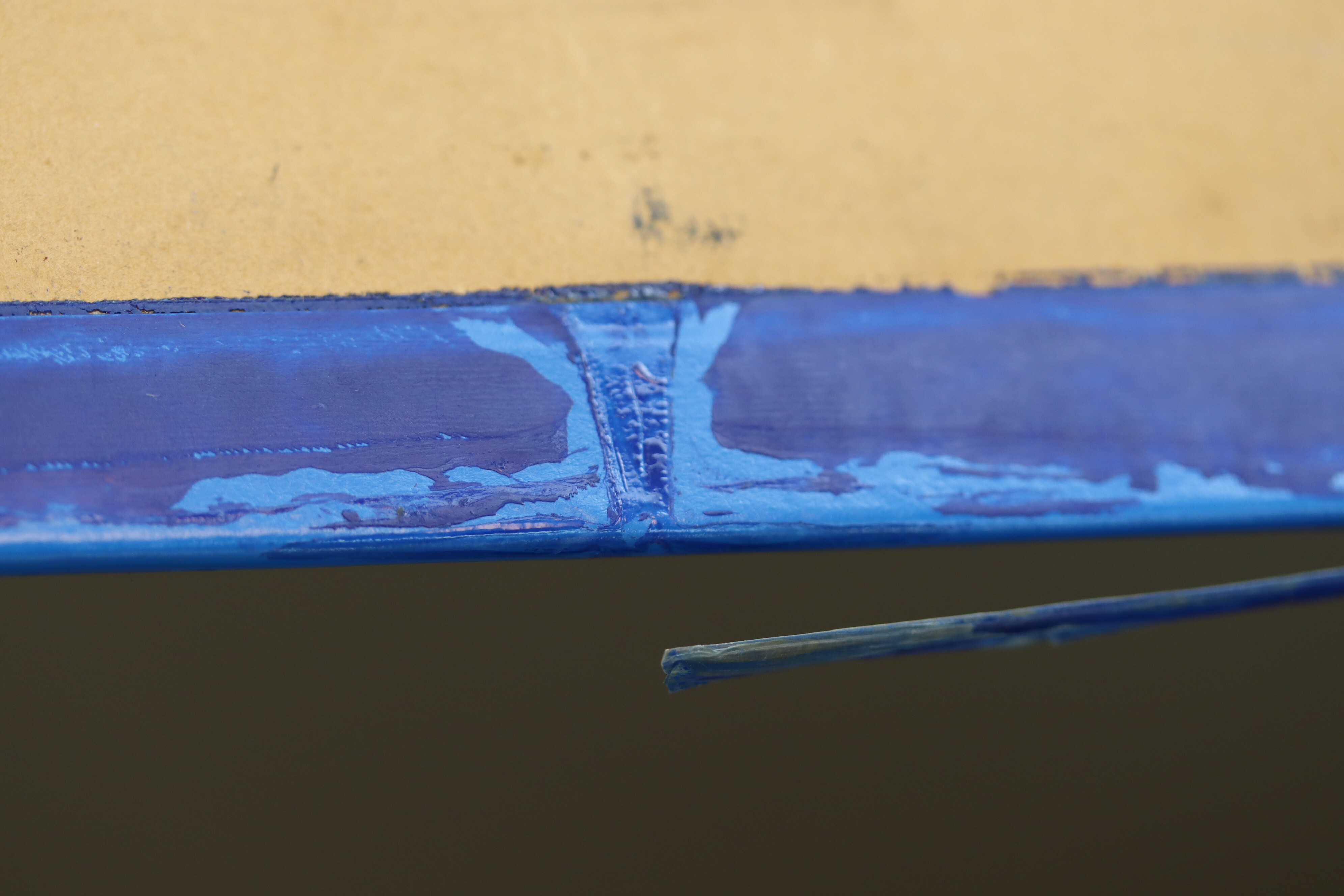
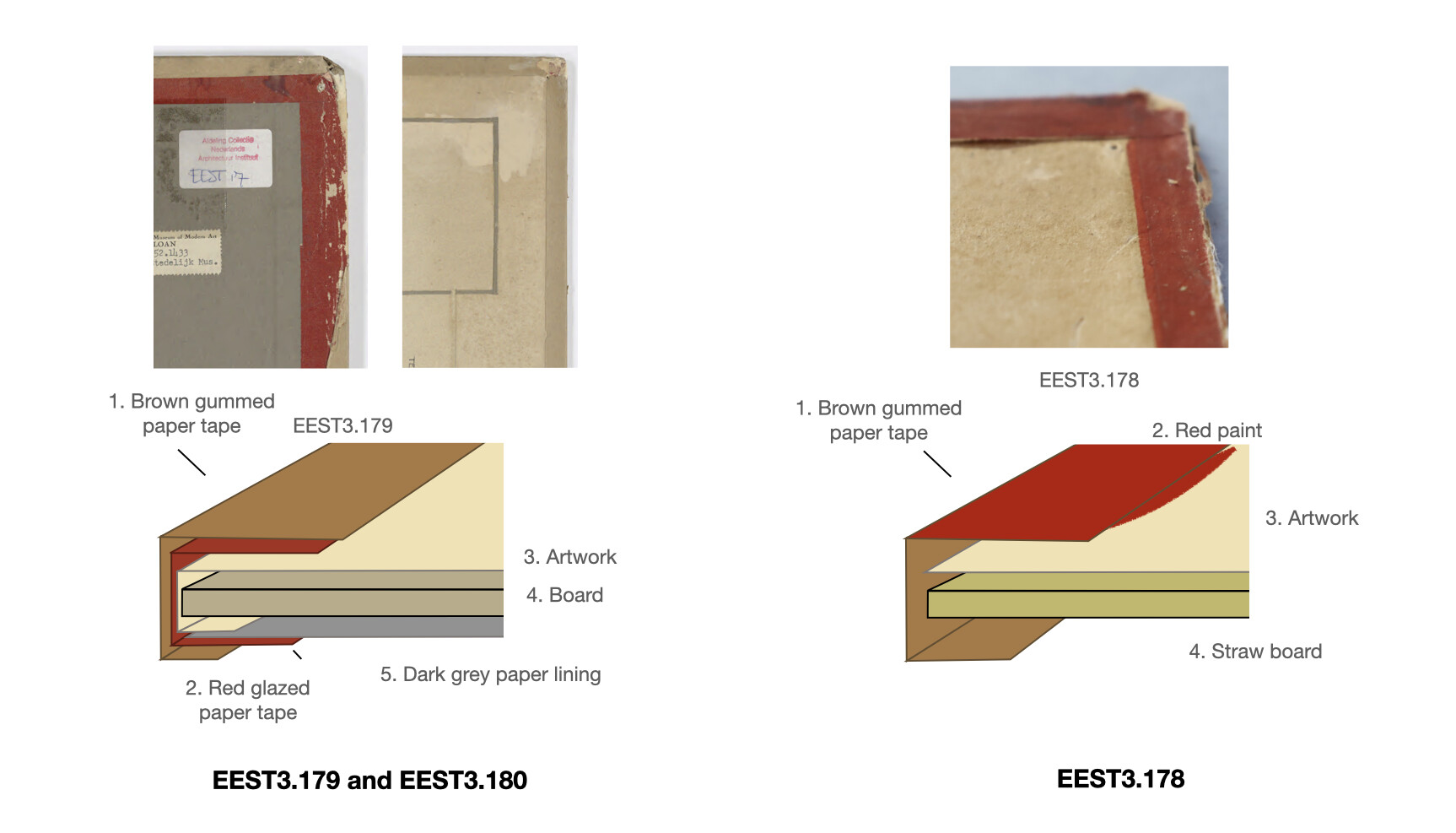
made of brown gummed tape that was painted red (Figs. 2, 3).
ExpandFig. 2Detail of the red-painted tape on the ground-floor
plan of Hôtel Particulier, 1923 (Collectie Nieuwe
Instituut/EEST, 3.178). Photo by RNA.ExpandFig. 3Detail of the transparent pressure-sensitive tape and
blue-coloured paint on the blue-glazed paper on the
second-floor plan of Maison Particulière, 1923
(Collectie Nieuwe Instituut/DOES, 029). Photo by
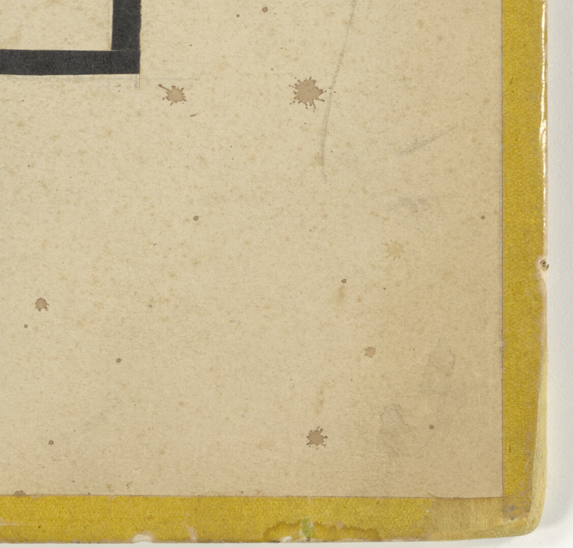
RNA.ExpandFig. 4Detail of the yellow-glazed paper on the first-floor
plan of Maison d’Artiste, 1923 (Collectie Nieuwe
Instituut/DOES, AB5127). Photo by RNA.
Within the conservation team, the general attitude was that
pressure-sensitive tape used for mending tears should be
replaced with chemically and mechanically more stable
alternatives to prevent further potential degradation of the
objects. In the case of these floor plans, however, the
coloured tapes consist of many different layers of materials
and they were not primarily used for repairs. Moreover, the
bold primary colours of the edges contribute significantly to
the visual reception of the works.
Usually, for treatment dilemmas such as these, the
conservators consult the curators. However, in this case
neither the conservators nor the curators of the archive knew
the function of these coloured tapes, whether they were
contemporary, who added them, or their historical and artistic
value. Before the conservators could proceed with the
treatment of these floor plans, the nature and potential
artistic significance of the different layers of
coloured-frame tapes had to be determined.
Answers to these questions were found by delving into the
history of these objects, researching why the floor plans were
created and what happened to them after they were made. To
resolve the treatment dilemma, nine material biographies of
the artworks were written, including the creators’
motivations, the provenance of the floor plans, their
exhibition history, and a material analysis. The present paper
shows how a technical study of objects is essential for art
historical research and the interpretation of objects, as well
as for their preservation.
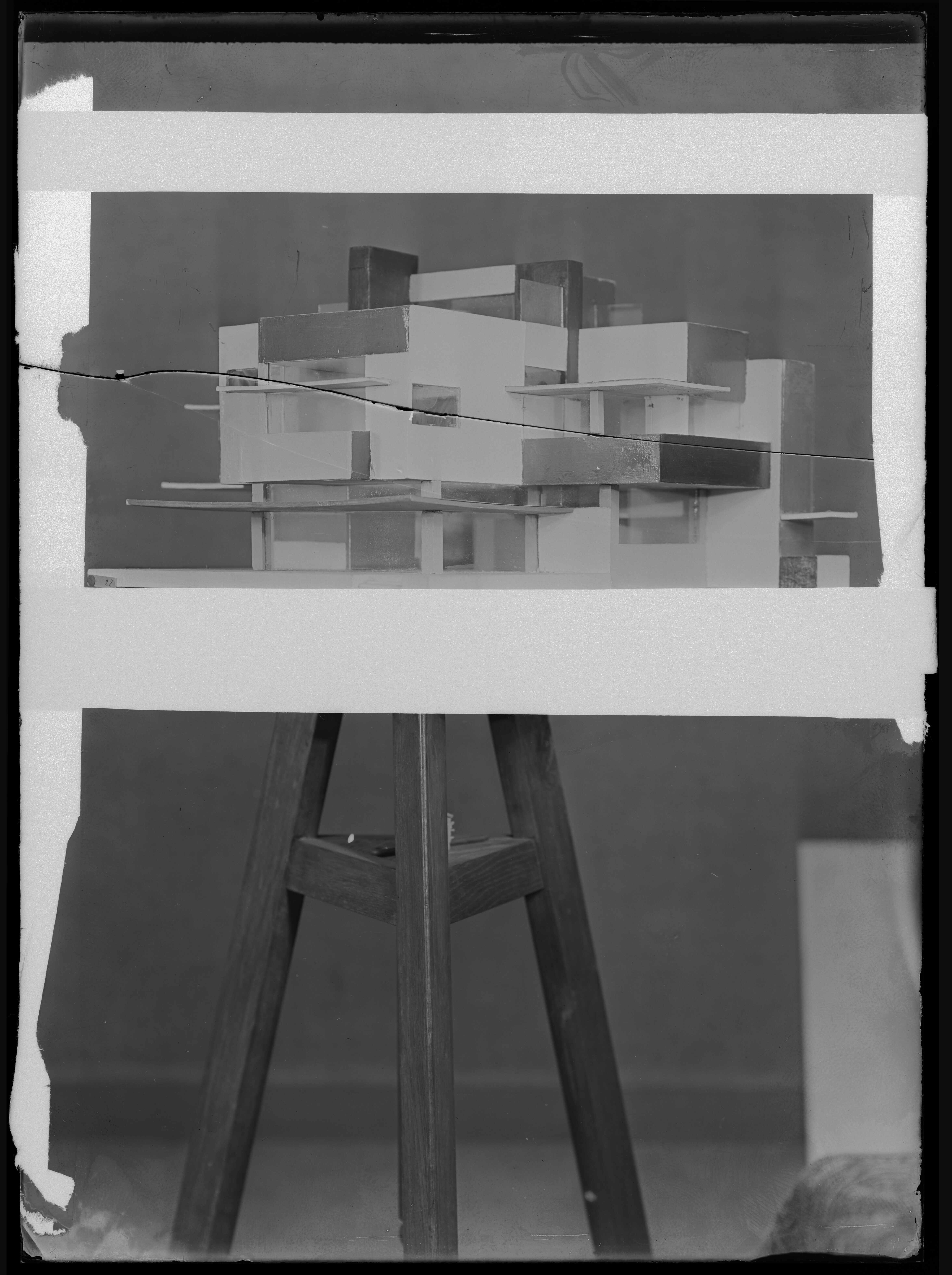
ExpandFig. 5Cornelis van Eesteren (left) and Theo van Doesburg
(right) with their maquette of Maison Particulière in
their studio, 1923 (Collectie Nieuwe Instituut/DOES,
AB5302+). Photographer unknown.
Materiality and concept, colour and construction: the initial
creation of the nine floor plans
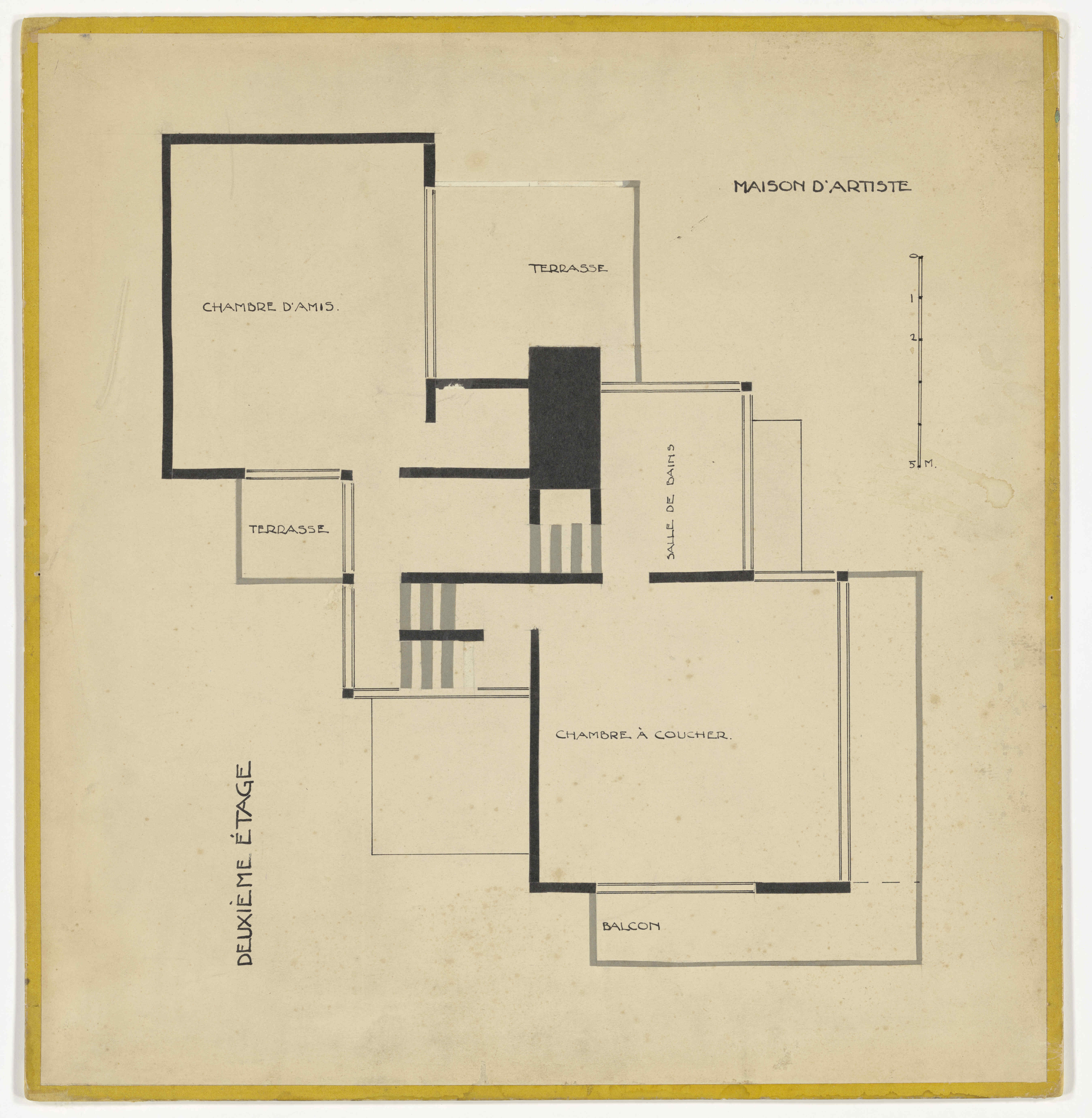
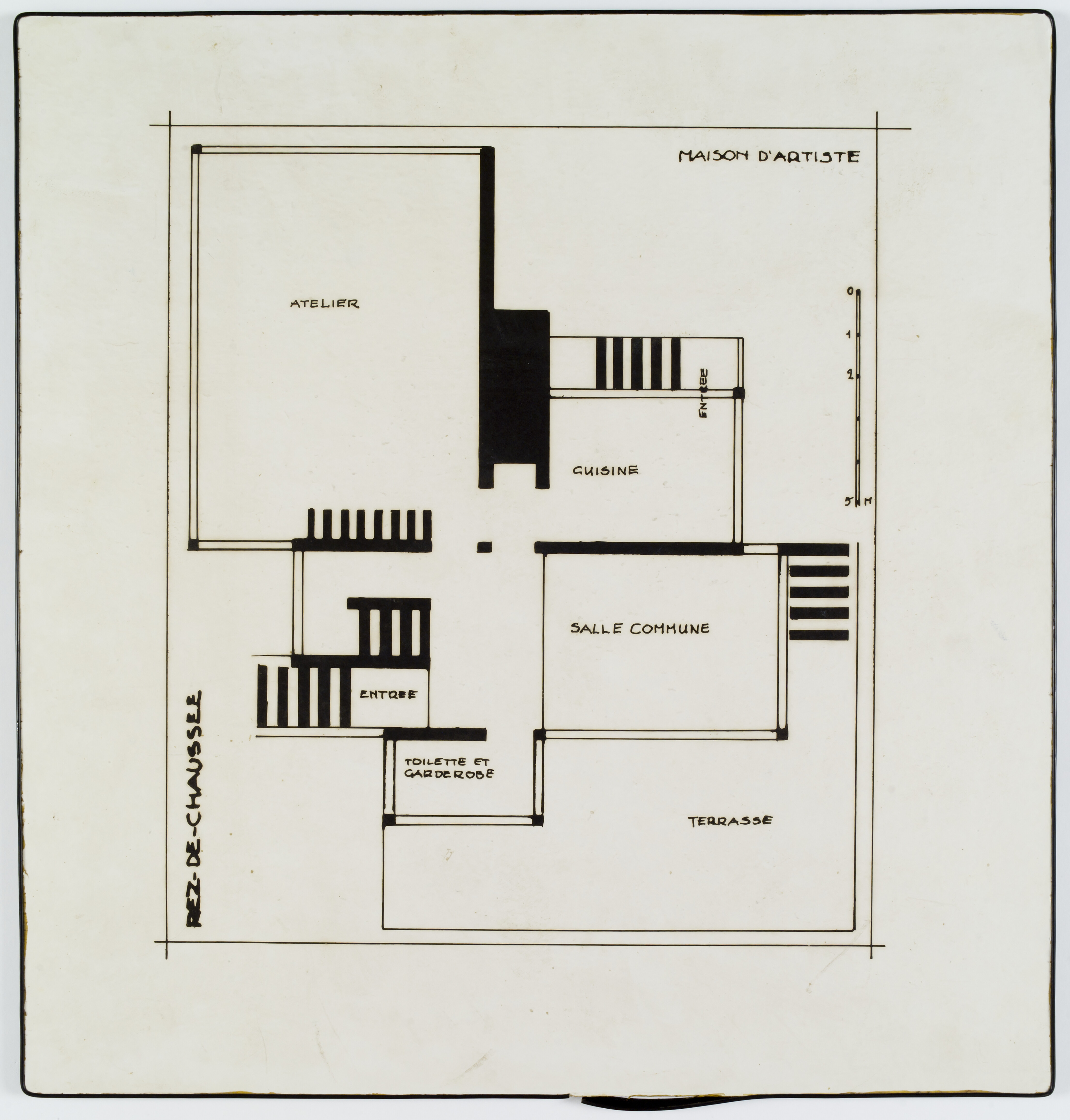
The nine mounted floor plans were made by Cornelis van
Eesteren and Theo van Doesburg (Fig. 5) in 1923 and are
designs for three buildings or projects: an artist’s house
(Maison d’Artiste),
a private house (Maison Particulière), and a private villa (Hôtel Particulier, also known as Maison Rosenberg). Originally, ten floor
plans were made but the ground-floor plan of
Maison d’Artiste was
lost over time. The floor plans were originally made for the
De Stijl exhibition at Galerie l’Effort Moderne in
Paris, hosted by Leonce Rosenberg from October 15 to November
15, 1923, during a formative period for the art movement.2
Rosenberg had requested that De Stijl design a cultural
centre, but Van Eesteren and Van Doesburg took their own
course and designed three buildings instead—Hôtel Particulier, Maison Particulière,
and
Maison d’Artiste—which represent the start of collaboration between the
architect Van Eesteren and the painter Van Doesburg.
Perhaps remarkably, the designs were not made to be
executed.3
Rather, the designs for the three projects were displayed at
the 1923 exhibition as an experiment to integrate architecture
and the art of painting, a central theme for Van Doesburg and
De Stijl.4
Art historian Manfred Bock writes that Van Eesteren and Van
Doesburg’s collaboration can be understood as an attempt to
integrate painting and architecture by creating tension
between colour and design, and between concept and
material.5
An important part of this integration of painting and
architecture was the use of colour. Van Doesburg addresses
these tensions between colour and architecture in a letter to
Van Eesteren when he writes that the exhibition itself was
their first “manifesto.” They sought to maximise the tension
between architecture, which Van Doesburg perceived as
“purpose-art,” and the “free aesthetic expression of colour”
to create “the impact of a bomb” on the established
conventions.6
To convince the audience of the exhibition, they published a
manifesto that expressed their visions for architecture and
painting.7
For the three projects (Maison d’Artiste, Maison Particulière,
and Hôtel Particulier),
not only were nine floor plans made, but also axonometric
projections, “contra-constructions,” and maquettes (Figs. 6–10
of
Maison Particulière
below).8
While the floor plans are two-dimensional plans, the
axonometric projections (Fig. 7) show the space in three
dimensions. The “contra-constructions,” a term coined by Van
Doesburg, deconstruct the axonometric projections into spaces
of colour without structure, as can be seen in Figure 9. The
maquettes are scale models of the buildings that show both
colour and three-dimensional space. Thus, the floor plans were
designed in combination with other designs, all of which were
on display at the exhibition.
ExpandFig. 6The first-stage architectural design: the
ground-floor plan of Maison Particulière, 1923
(Collectie Nieuwe Instituut/DOES, 030) and the
axonometric projection of Maison Particulière from the
southwest, 1923 (Collectie Nieuwe Instituut/ DOES,
AB5115).ExpandFig. 7The first-stage architectural design: the
ground-floor plan of Maison Particulière, 1923
(Collectie Nieuwe Instituut/DOES, 030) and the
axonometric projection of Maison Particulière from the
southwest, 1923 (Collectie Nieuwe Instituut/ DOES,
AB5115).
ExpandFig. 8Second-stage colour analysis: colour analysis on the
axonometric projection of Maison Particulière from the
northwest (Collectie Nieuwe Instituut/EEST, 3.181) and
contra-construction of Maison Particulière from the
southwest, 1923 (DOES, AB5117).ExpandFig. 9Second-stage colour analysis: colour analysis on the
axonometric projection of Maison Particulière from the
northwest (Collectie Nieuwe Instituut/EEST, 3.181) and
contra-construction of Maison Particulière from the
southwest, 1923 (DOES, AB5117).
ExpandFig. 10Third-stage synthesis: photo of the maquette of
Maison Particulière from the southeast. Photographer
unknown, 1923 (Collectie Nieuwe Instituut/ DOES,
AB5125).
To interpret how the designs relate to each other and to
demonstrate the intended integration of architecture and
painting, I suggest categorising the designs exhibited in 1923
into three stages: architectural design, colour analysis, and
synthesis.9
The floor plans and axonometric projections are the first
stage, where space is created two- and three-dimensionally in
an architectural manner. In the second stage, colour is
introduced and construction removed, creating the
contra-constructions. The maquettes would then be the final
stage, where synthesis is achieved through a coloured physical
model of the finished building. The floor plans and the
axonometric projections can be regarded as the closest to
traditional architectural designs. The contra-constructions,
however, are closer to neoplastic abstract painting*.*
In this context, the coloured frames of the floor plans (Fig.
6) forecast the colours that will be introduced to the
greyscale architectural designs. The colours used for these
objects were not chosen at random. For Van Doesburg, harmony
in design was best achieved by combining the three “positive”
primary colours red, blue, and yellow with the “negative”
noncolours black, grey, and white.10
In the period 1920–23, when working with architect Cornelis
Rienks de Boer (1881-1966), Van Doesburg was developing what
he called a “scientific theory of colour.”11
In his view, fields of positive primary colours should always
be separated by “walls” of the “supporting-colours” white,
grey, or black to create “a harmonious distribution.12
To establish the transition from architecture to art, Van
Doesburg created colour analyses on the axonometric
projections to make spaces of colour void of construction.13
These are the contra-constructions, in which only the fields
of colour remain, as if they are floating in the air.
The floor plans were exhibited in 1923 as one element of the
designs for the three projects that sought to integrate
architecture and painting or colour. The floor plans show
frames in the primary colours red, blue, and yellow. In this
process of integration, the coloured frames in primary colours
form the first addition of colour to the greyscale designs and
as such forecast the colour analysis and contra-constructions.
This interpretation highlights the importance of knowing the
intentionality behind the addition of the coloured frames,
when they were added, and whether they were contemporary with
the architectural designs for the 1923 exhibition.
Who created the reds, blues and yellows?
The floor plans arrived in the conservation studio in separate
batches without the information that the nine plans were
designed as a single set or that the coloured frames were
significant to the design. This information was not part of
the object’s documentation at the HNI, nor had it appeared in
the secondary literature or the catalogue raisonné.14
It was the similarities in the mounting methods and the
remarkable coloured tape frames, which do not appear in any
other works by Van Doesburg and Van Eesteren that were part of
the conservation project, that triggered the conservation
team’s research. After learning about the context of the 1923
exhibition for which the floor plans were designed, the team
aimed to understand who created them.
Initially, the 1923 exhibition sought to demonstrate a
collective idea or expression of the De Stijl group as a
whole, and many of its members were expected to
participate.15
In the end, however, only the works of Van Doesburg, Van
Eesteren, and Gerrit Rietveld were presented prominently, with
a few contributions from other members.16
As such, the exhibition was reduced to a collaboration among
only a few individuals, with Van Doesburg and Van Eesteren as
the main contributors, since Rietveld only created a single
maquette for
Hôtel Particulier.17
ExpandFig. 11Plans for the ground (Collectie Nieuwe
Instituut/EEST, 3.178), first (EEST, 3.179), and
second (EEST, 3.180) floors of Hôtel Particulier,
1923.ExpandFig. 12Plans for the ground (Collectie Nieuwe
Instituut/EEST, 3.178), first (EEST, 3.179), and
second (EEST, 3.180) floors of Hôtel Particulier,
1923.ExpandFig. 13Plans for the ground (Collectie Nieuwe
Instituut/EEST, 3.178), first (EEST, 3.179), and
second (EEST, 3.180) floors of Hôtel Particulier,
1923.
The “red” floor plans display the ground, first, and second
floors of
Hôtel Particulier. This is
a design for a villa for Leonce Rosenberg (1879–1947), the
gallery owner who invited Van Doesburg to organise the
exhibition on De Stijl. In June 1923, only three months before
the start of the exhibition, Van Eesteren and Van Doesburg
started to work more systematically on the designs for the
three buildings. Van Eesteren made the first design of the
floor plan for
Hôtel Particulier in March
1923. The final design, from August 1923, shows little
influence by Van Doesburg, and as a result the architectural
design is commonly attributed to Van Eesteren alone.18
Bock notes, however, that the two discussed and exchanged
designs for the buildings in the months prior to the
exhibition, and as such the designs for the three buildings
stem from those discussions as well as their individual
contributions. Later, however, Van Doesburg complained about
how little influence he had on the Hôtel design.19
On August 6, about two months before the start of the
exhibition, Van Eesteren sent the designs to fellow De Stijl
member Gerrit Rietveld, who would make the maquette for the
exhibition. The maquette for
Hôtel Particulier was,
however, not finished in time for Van Doesburg to add colour
to it, leaving the synthesis of colour and architecture as
discussed above incomplete (see the uncoloured maquette in the
foreground in Fig. 1).
ExpandFig. 14Detail of the tapes and drop marks in the top right
corner of the second-floor plan of Hôtel Particulier, 1923
(Collectie Nieuwe Instituut/EEST, 3.180).
All nine plans are collages: the lines and shapes marking the
outlines of the building are not drawn, but pasted pieces of
dark paper. An interesting feature of the ground floor is the
use of sandpaper to represent the gravel of the tennis field
in the top left corner (Fig. 2). The coloured frames on the
three “reds” consist of varying materials. The red painted
frames on the ground-floor plan contrast with the unpainted
brown paper tape on the plans of the first and second floor.
Additionally, in the top right corner of the second-floor
plan, a bit of red tape has become visible. The various layers
of tapes will be further analysed below, but the variety of
tapes already suggests that the objects have been modified
over time. Additionally, the many stains and drop marks
indicate that the works have not been well preserved since
their initial creation (see the ground-floor and first-floor
plans in Fig. 1 for comparison). Some lines on the
ground-floor plan and the lighter area in the top right corner
of the first-floor plan have been retouched.
ExpandFig. 15Plans for the first (Collectie Nieuwe Instituut/DOES,
028), second (DOES, 029), and ground (DOES, 030)
floors of Maison Particulière, 1923.ExpandFig. 16Plans for the first (Collectie Nieuwe Instituut/DOES,
028), second (DOES, 029), and ground (DOES, 030)
floors of Maison Particulière, 1923.ExpandFig. 17Plans for the first (Collectie Nieuwe Instituut/DOES,
028), second (DOES, 029), and ground (DOES, 030)
floors of Maison Particulière, 1923.
The “blue” set of floor plans of
Maison Particulière, a
design for a house, was based on architectural principles
similar to those for the Hôtel but in more modest proportions
and at a very different scale.20
For Maison Particulière,
the consensus is that Van Eesteren developed the floor plans
as well as the axonometric projections, while Van Doesburg
added the colour to the latter and offered an artistic
interpretation with the contra-constructions (see “Materiality
and Concept” above).21
According to Bock, Van Eesteren designed the floor plans for
Maison Particulière
based on his earlier design titled Huis Pijl (1923).
The similarities of the floor plans of these two designs
indicate that Van Doesburg had little to no influence on the
architectural design of the floor plan.22
As with the Hôtel, it seems that Van Doesburg’s primary
contribution was to add colour to the architectural design and
to remove the architectural structure in the
contra-constructions. The maquette for this project was
completed and coloured on time by the duo themselves, who can
be seen balancing it on a stool in the left room of the
exhibition (Fig. 5).
ExpandFig. 18Detail showing PVC tape on the first-floor plan
(Collectie Nieuwe Instituut/DOES, 028), and detail of
glazed paper with transparent pressure-sensitive tapes
on the second-floor plan (DOES, 029) , 1923. Photos by
RNA.ExpandFig. 19Detail showing PVC tape on the first-floor plan
(Collectie Nieuwe Instituut/DOES, 028), and detail of
glazed paper with transparent pressure-sensitive tapes
on the second-floor plan (DOES, 029) , 1923. Photos by
RNA.
Technically, the collages of
Maison Particulière were
produced in the same manner as
Hôtel Particulier, but
instead of painted brown paper, these have blue-glazed paper
frames. The first floor, on the left, has a light blue frame
made of blue polyvinyl chloride tape, and the ground floor, on
the right, has a different, noticeably darker blue painted
frame than the second floor. The paper substrate of the ground
floor shows drop stains and is tensioning in the corners,
indicating that the work was locally adhered to the backboard
at some point.
ExpandFig. 20Plans for the first (Collectie Nieuwe Instituut/DOES,
AB5127), second (DOES, AB5128), and third (DOES,
AB5129) floors of Maison d’Artiste, 1923.ExpandFig. 21Plans for the first (Collectie Nieuwe Instituut/DOES,
AB5127), second (DOES, AB5128), and third (DOES,
AB5129) floors of Maison d’Artiste, 1923.ExpandFig. 22Plans for the first (Collectie Nieuwe Instituut/DOES,
AB5127), second (DOES, AB5128), and third (DOES,
AB5129) floors of Maison d’Artiste, 1923.
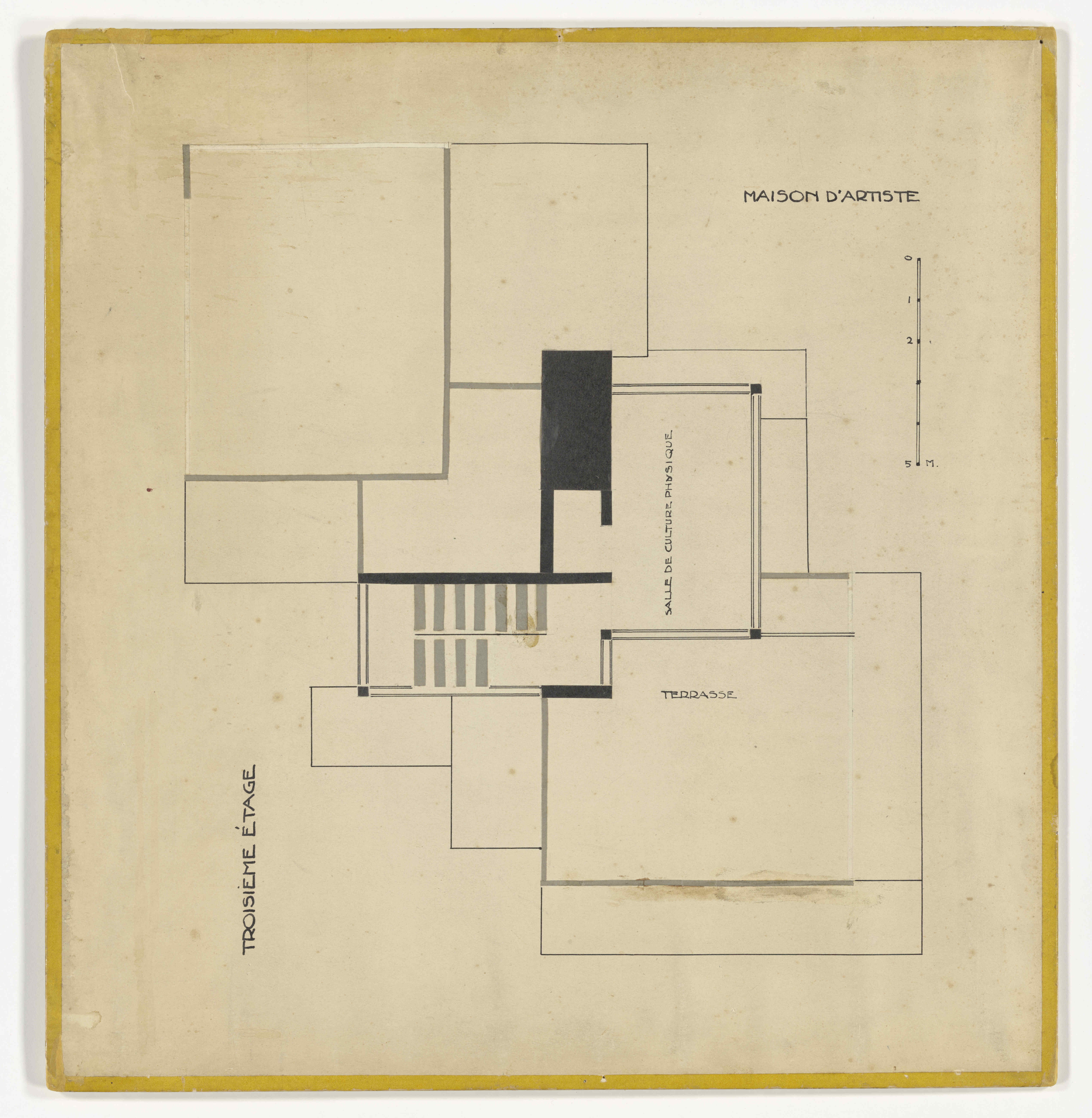
The “yellow” set—Maison d’Artiste—contains the smallest house of the three projects and was
the last to be designed. According to historian Kees Somer,
Maison d’Artiste
could be regarded as the pinnacle of collaboration between the
architect and the painter, with an almost equal contribution
from both.23
Whether this interpretation is adequate remains to be seen, as
Bock points out that this design is, like
Maison Particulière,
based on another project. He states that the initial design of
Maison d’Artiste was
based on a sketch quickly drawn up by Van Doesburg for the
family Groutars-Scholte and his ideas for a house in
“bi-carré.”24
Van Eesteren was not in agreement with these designs by Van
Doesburg and modified them to be used for the
Maison d’Artiste
project.25
In contrast to the previous two designs, Van Doesburg
developed the first concept, but in terms of the division of
labour, Van Eesteren was responsible for providing the proper
architectural plan to ensure the design was structurally
feasible. Later, Van Doesburg would characterise Van
Eesteren’s floor plans as “displaced bi-carré” and considered
Van Eesteren’s “architectural education” (i.e. Van Eesteren’s
architecturally necessary technical modifications) as “a
confusion of his
Maison d’Artiste.”26
ExpandFig. 23Detail of stains and spots on the first-floor plan of
Maison d’Artiste (Collectie Nieuwe Instituut/DOES,
AB5127), 1923. Photo by RNA.
The collages for
Maison d’Artiste
depict the first, second, and third floors and have
yellow-glazed paper frames; a fourth collage of the ground
floor remains lost. As in the other plans, some paper collage
strips are missing and have not been replaced or retouched.
The first floor shows stains while the others do not, perhaps
because they were stored on top of each other and the
first-floor plan was uncovered at the top. The yellow set is
the only one with glazed paper frames of a single type without
additions of pressure-sensitive tapes like those on the blue
floor plans or the brown gummed tape on the red plans. The
pinholes in the corners of the third floor reveal a past
hanging method similar to that of the three red plans of
Hôtel Particulier and the
first-floor plan of the blue
Maison Particulière.
A detailed comparison of the floor plans reveals notable
similarities in their material construction. They are all
collages with paper and ink on machine-made paper, mounted on
boards by folding the paper around the board and covering it
with coloured frames. A clear difference, however—apart from
the different levels of collaboration when creating the floor
plans—is the structure of the coloured frames. The frames
appear to consist of at least six different surface materials,
including red and blue paint, brown paper, a blue polyvinyl
chloride tape, glazed paper tape in blue and yellow, and
transparent tape. The different layers of tape we see today
indicate that layers of tape were added over time and also
that the frames have not always had their present appearance.
As such, the frames do not unequivocally display a consistent
method of mounting, raising questions about who added the
frames and when.
As the frames are visible in Figure 1, it is clear that the
coloured frames were added during preparations for the
exhibition. Van Doesburg and Van Eesteren had to work against
the clock to finish everything on time, and their working
relationship increasingly became a rational division of labour
rather than a coproduction in which both could be named
architect and artist.27
The pressure of the deadline made a division of work according
to their respective skills and knowledge seem the most likely.
The collaboration of Van Eesteren and Van Doesburg has been a
subject of significant debate in the literature, primarily
fuelled by claims of authorship from both creators. Soon after
the initial exhibition in 1923, each had already claimed to be
the sole creator of the designs.28
In an agitated letter on authorship, Van Doesburg writes to
Van Eesteren that he is the “geestelijk uitvinder”
(ideational inventor) and Van Eesteren only the “praktische uitvinder” (practical inventor) of the works.29
From this remark, we may consider Van Eesteren the
“purpose-artist” or artistic contractor who drew up the plans
on which Van Doesburg created the colour analyses and
contra-constructions. Continuing along this line, Van Eesteren
would then be the architect behind all the floor plans, while
Van Doesburg provided the artistic influence and colours.30
This role division in constructing and colouring mirrors how
Van Doesburg worked with another architect in the years before
he met Van Eesteren.31
It is also supported by the consistency of the handwriting on
the floor plans, which is all Van Eesteren’s.32
The floor plans, of course, lack any form of colour other than
the frames. The primary colours red, blue, and yellow are
typical for De Stijl and very important to Van Doesburg’s
colour theory, and thus it is difficult to believe that Van
Doesburg was not involved in adding these colours to the
plans.
Van Doesburg and Van Eesteren had to fully finance and
assemble the exhibition on their own.33
Due to their limited funds at the time, it is likely that the
more practical Van Eesteren not only created the collages but
also mounted the floor plans himself.34
Even though he seems the probable creator, whose hand actually
pasted on the frames cannot be stated with certainty. We could
even imagine, for example, that Van Doesburg’s third wife,
Nelly van Moorsel, assisted with the mounting, as she
supported them day and night throughout these years.35
After the exhibition: from colour to greyscale
Following the De Stijl exhibition at Galerie l’Effort
Moderne in the fall of 1923, the process of integrating
painting and architecture was continued by Van Doesburg and
Van Eesteren. After all, the projects were not finished and
the buildings had not been executed. To continue publishing
and exhibiting their designs and ideas, Van Doesburg and Van
Eesteren hired Paul Lemare to photograph their designs,
including the maquettes.36
The greyscale photos were intended for publication in
De Stijl magazine to continue discussions of the
designs in future issues.37
Important for the conservation dilemma is the fact that none
of the floor plan reproductions made by the creators include
coloured frames—even in greyscale.38
By creating the greyscale photographs, the creators
incompletely reproduced their works of art in a new material
medium. In doing so, the artistic value of the non-replicated
material elements (e.g., colour and paint) as well as that of
the reproduction itself can be questioned. Many of the works
produced by Van Doesburg and Van Eesteren exist in a grey
area, functioning as both architectural plans and singular
works of art. Sometimes this resulted in reproductions that
were acceptable to an architect, but not to an artist.
Working within a small budget after the exhibition, Van
Eesteren hired a photographer, but Van Doesburg, who was no
longer in Paris, did not approve of the photos. Van Doesburg
complained to Van Eesteren in multiple letters, urging him to
request a refund from the photographer, because the images did
not capture the designs properly. He was upset about how poor
the colour analyses looked in greyscale. A section of their
correspondence is cited below.
Van Doesburg writing to Van Eesteren, November 23, 1923
(translation by the author):39
“Beste C!
Jammer dat de foto’s voor het merendeel onbruikbaar zijn. Van de modellen
zijn alle slecht, behalve die in vogelvlucht gezien en
Huis Rosenberg. De platte gronden zijn goed, maar de
kleur-analysen zijn ook zwak. Voorts mankeert aan alle
wat, troebel, onzuiver, zwarte vlekjes enz, Ook zijn ze te
klein, zelfs de grootste. Alleen die van jouw Universiteit
(de plattengronden enz) zijn goed van grootte. De vloer is
heelemaal maar niet gemaakt, terwijl ook geen opname van
de achterzaaltjes gemaakt is. Ik was zeer teleurgesteld.
Een zooitje. Ook geen hoogglans. De 5 groote foto’s van de modellen kunnen we dus niet gebruiken. Geef ze
dus vooral snel voor reproductie. De fout hiervan is dat
het model, niet het huis gefotografeerd werd. (…) Die
belichting met reflector is te scherp, waardoor alle
kleine gebreken van het model gefotografeerd zijn. Jammer
van het weggesmeten geld. Kun je het die vent niet over
laten doen. We behoeven ze toch niet te accepteren als ze
slecht zijn! Wie gaat nu een model op het voetstuk
fotografeeren! Blöd! Ik meende, dat ik het aan jou kon
overlaten, daar jouw opnamen goed waren en veel geschikter
voor clichée…”
Dear C!
Shame that most of the photos are unusable. The models are
all badly captured, except for those from a bird’s-eye view
and House Rosenberg. The floor plans are good, but the
colour analyses are poor too. All have flaws, opaque,
unclear, black spots, etc. They are too small, even the
largest ones. Only the ones of your University (the floor
plans etc.) are the right size.40
The floor is completely omitted, neither are the back rooms.
I was very disappointed. A mess. No glossy photo paper
either. The 5 large photos of the models are unusable. Make
sure to give them [the photos or the models] quickly for
reproduction. The mistake is that the model is photographed
rather than the house. . . . The light of the reflector is
too strong, thereby showing all the flaws of the model.
Shame of the wasted money. Can’t you have that bloke redo
it? We do not have to accept them if they are poor. Who
photographs a model on a pedestal! Blöd! I thought I could
leave this to you, as your captures were good and much
better for cliché.41
As the letter shows, Van Doesburg was not happy with how the
photos represented their work for the 1923 exhibition,
including the floor plans. Therefore, he decided to retouch
the glass plate negatives and cover the stool on which the
maquette was displayed with paper tape (Fig. 24). In doing so,
he continued the experimental process of the designs.42
The fact that Van Doesburg and Van Eesteren were creating
materially different reproductions of the original floor plans
has implications for how the creators viewed their works of
art. While the greyscale photos could be used to reproduce Van
Eesteren’s architectural design, they were of limited use in
transmitting Van Doesburg’s colour analysis. Architects in the
early twentieth century often used reproduction techniques
such as light printing (e.g., diazotypes) to edit and modify
plans on a copy of the original. As such, an architectural
design could be regarded as an instruction sheet for
construction, a document not necessarily limited by its medium
and materiality, as a work of art would be.
ExpandFig. 24Glass-plate negative of Maison Particulière made by Paul
Lemare with retouches in black paper tape (here showing in
white) by Van Doesburg, 1923 (Collectie Nieuwe Instituut.
EEST 11n4). “The light of the reflector is too strong,
thereby showing all the flaws of the model. . . . Who
photographs a model on a pedestal! Blöd!”
Many of the designs in the Van Doesburg Collection at Het
Nieuwe Instituut (HNI) are diazotypes identical to those
generally used by architects. But, in contrast to other
architects, Van Doesburg applied colour to the diazotypes,
effectively making the reproduction technique unusable. Due to
the greyscale light-printing technique, if an architect
designs a red wall, he would normally write the word
red on the reproduction. Van Doesburg, however, often
applied red paint to the diazotype—which, of course, cannot be
reproduced with light printing. In doing so, the reproducible
technical drawing was changed by the artist to a singular
object that is constrained by its medium and materiality. An
example of this is the coloured design in Figure 8. For an
architect, the end product is normally the building itself,
and any other expression of the design is therefore a
preliminary state in the process toward that end. When an
architect reproduces a design, both versions are considered
preliminary states of the actual building. In this regard, the
painter’s practice is fundamentally different. For a painter,
any expression of a design can be the end product—that is, a
work of art.
In an interview given shortly before the 1923 exhibition, Van
Doesburg stated that “the art of painting has to guide the art
of building. . . . The colour visualises the spatial effect
intended by the architect. In this manner, colour completes
the architectural design.”43
These remarks further underline that for Van Doesburg colour
was just as essential as structure for a building design. The
coloured frames on the architectural floor plan are the first
introduction of colour in the process of integrating painting
and architecture. Colour also transforms the reproducible
architectural design into a singular art object. This became
immediately apparent when the floor plans were reproduced: all
the reproductions lack the coloured frames. The latter are
only present on the mounted collages and not in any other
versions of the plans. As a consequence, the coloured frames
of the mounted floor plans were forgotten, and over time their
meaning was lost, as will be discussed below.
Reproductions and originals
ExpandFig. 25Photo reproduction of the ground-floor plan of Maison
d’Artiste (Collectie Nieuwe Instituut/DOES, AB5126) after
1923. The original collage has been lost.
Among the first sources the conservation team looked for when
researching the nature of the coloured frame tapes were
photographs of the works made in the past century. These
pictures not only capture the varying stages of damage or
deterioration over time, but also assist in identifying later
modifications. As the pictures made by Van Doesburg and Van
Eesteren did not include the frames, this set the tone for
many subsequent reproductions.
The omission of the coloured frames in the photo reproductions
is at odds with the original collages exhibited in 1923.
Despite this, in the De Stijl exhibition at the Van
Abbemuseum in 1968, the photocopy (Fig. 25) of the original
collage of the ground-floor plan for
Maison d’Artiste was
used as a replacement for the collage that was lost.44
In this case, the photograph of the lost collage served as an
effective reproduction of the architectural plan, but of
course, it failed to transmit the colour of the original
collage.
Historiographical difficulties arise because reproductions
have been continuously but used in the literature as
substitutes for the original collages.45
In 2016 historian Dolf Broekhuizen reproduced the photo
reproduction of the ground-floor plan of
Maison d’Artiste
(Fig. 25) next to the collages of the other floors with the
yellow frames cut off as if they do not exist.46
From the accompanying text, the reader is led to believe that
all four images display originals. The habit of depicting the
reproductions as the originals is not limited to the monograph
by Broekhuizen, but also extends to the catalogue raisonné
published by historian Els Hoek in 2000, in which some of the
original collages are reproduced with frames while others have
the frames cut off.47
Additionally, the collage of the ground floor of
Hôtel Particulier is
omitted from the catalogue raisonné, and instead another photo
reproduction is printed as if it were the original
collage.48
Clearly, the meaning of the coloured frames has been lost over
time.
Since Van Doesburg and Van Eesteren had the reproductions made
themselves and historians continue to reproduce and discuss
the works, omissions and obscurities related to the nature of
the original and the reproduction have slipped into the
discourse. The material perspective of the conservators calls
attention to the importance of the material properties of
artworks. As scholars work increasingly with digitised
sources, they should be aware that their knowledge is
constrained by what is visually presented to them in print and
online. They are, therefore, prone to omit what could have
been perceived when encountering the original physical object.
ExpandFig. 26Verso of the ground-floor plan, Hôtel Particulier
(Collectie Nieuwe Instituut/EEST, 3.178),ExpandFig. 27Verso of the first-floor plan, Hôtel Particulier
(EEST, 3.179).ExpandFig. 28Verso of the second-floor plan, Hôtel Particulier
(EEST, 3.180).
ExpandFig. 29Verso of the first-floor plan, Maison Particulière
(DOES, 028).ExpandFig. 30Verso of the second-floor plan, Maison Particulière
(DOES, 029).ExpandFig. 31Verso of the ground-floor plan, Maison Particulière
(DOES, 030).
ExpandFig. 32Verso of the first-floor plan, Maison d’Artiste
(DOES, AB5127).ExpandFig. 33Verso of the second-floor plan, Maison d’Artiste
(DOES, AB5128).ExpandFig. 34Verso of the third-floor, plan Maison d’Artiste
(DOES, AB5129).
Nine material biographies
The conclusion that the coloured frames of the works were part
of the initial design of the floor plans in 1923 allows us to
better interpret the photograph of the 1923 exhibition (Fig. 1
and 35). With the exception of this image, photo reproductions
in the literature often do not show the coloured frames.
Moreover, the three projects are often discussed separately
from each other; the projects were presented as a set in the
context of the 1923 exhibition, but subsequently they were
treated as separate projects.
In order for the conservation team to understand what happened
to the nine floor plans after 1923, a material analysis of the
frames was undertaken to clarify the artistic relevance of
each layer of the coloured frames. That allowed us to identify
the original coloured frame depicted in the photo taken at the
1923 exhibition (Fig. 35). Combining the material analysis
with a timeline of the exhibition history, a material
biography of the history and changes of the objects over time
could be created (Fig. 35). No records of previous
conservation treatments exist, and thus no background
knowledge could be used to date the layers, but the exhibition
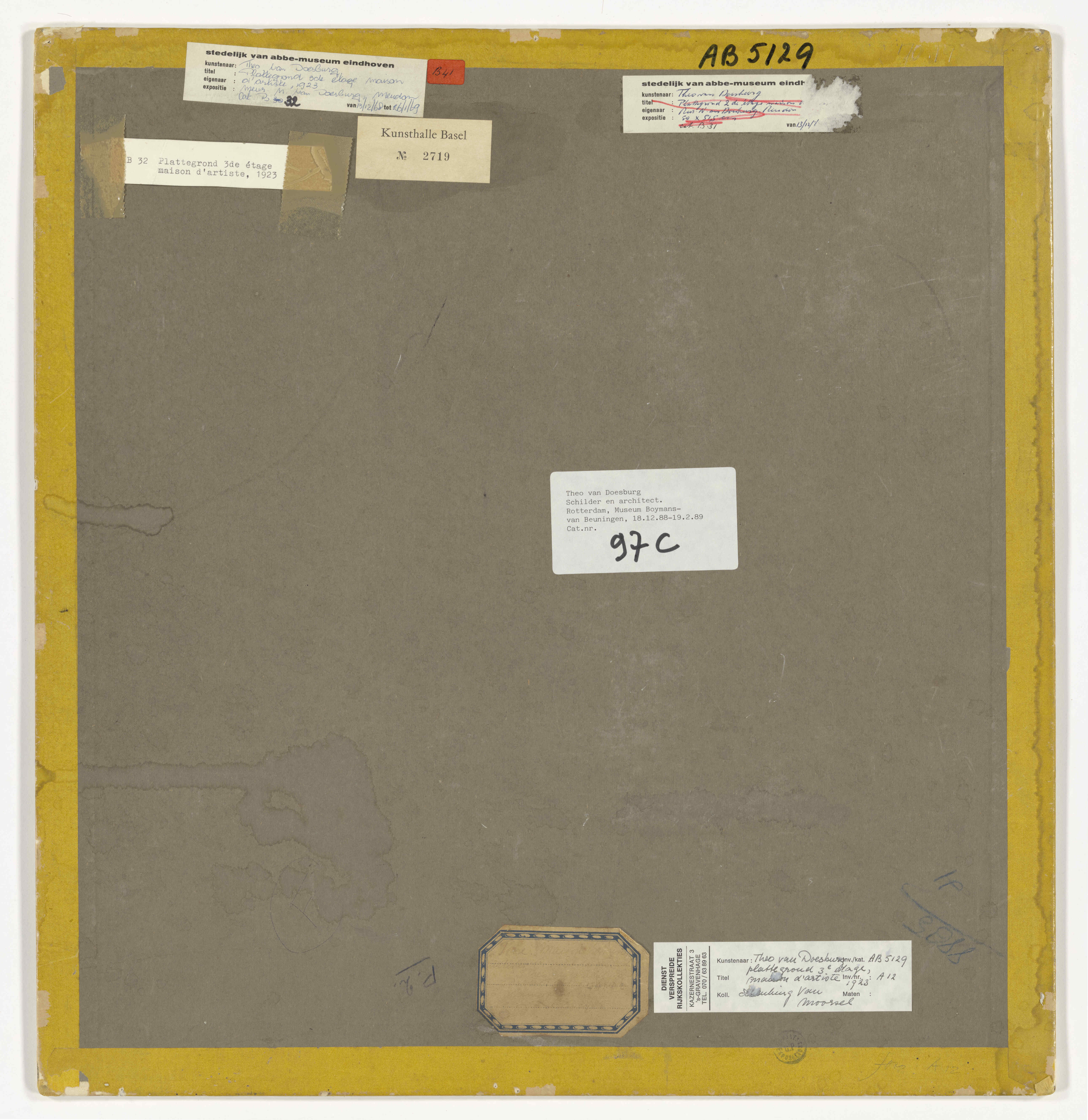
labels on the backs of the plans offered some clues.
ExpandFig. 35Detail of the photo of the exhibition
De Stijl, Galerie l’Effort Moderne, Paris
1923 (Collectie Nieuwe Instituut/EEST, 3.360n1) (fig.
1). Note the red frames on the ground- and first-floor
plans (EEST, 3.178; EEST, 3.179). In the front is the
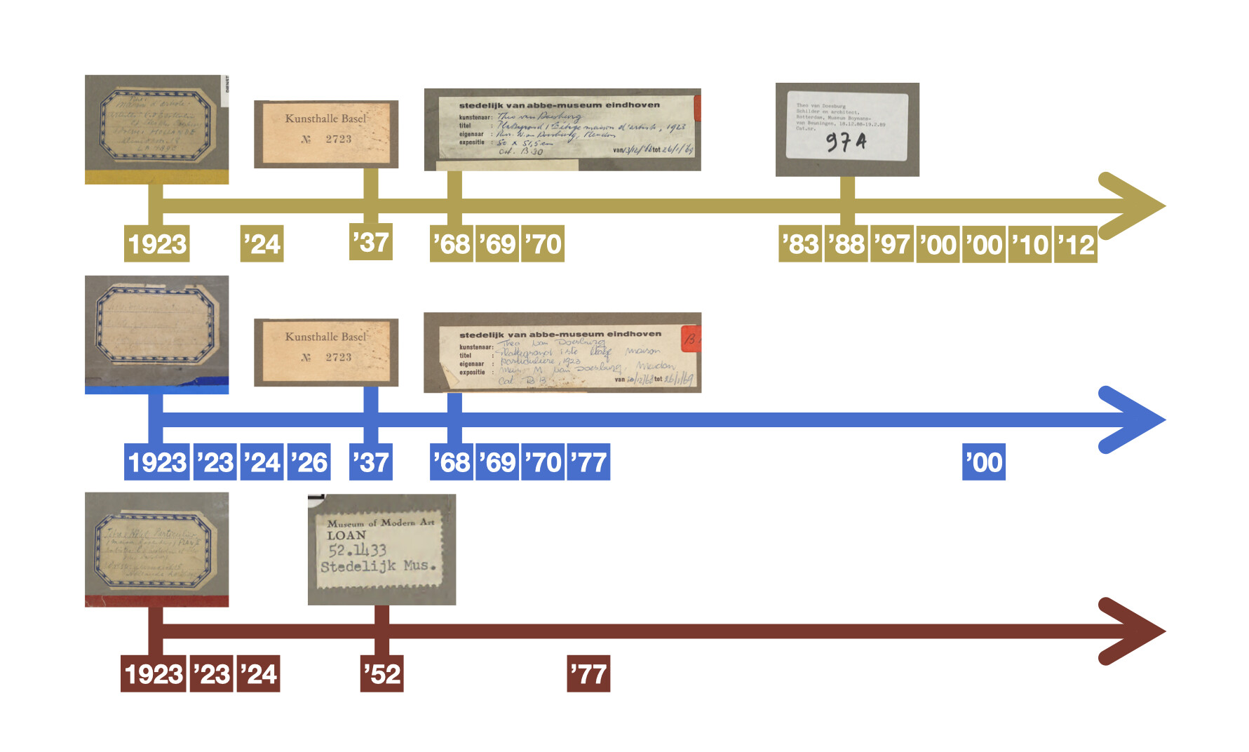
maquette of Maison d’Artiste.ExpandFig. 36Exhibition timeline and labels.
The exhibition timeline functions as a material chronicle that
has been constructed by combining material analysis of the
tapes with labels and records of the exhibition history. This
material chronicle summarises what happened to the plans after
their initial creation.
The first thing to note on the timeline (Fig. 36) is that
Maison d’Artiste,
indicated by the yellow line, has been exhibited most often.
Perhaps the smaller size of the yellow plans and continued
interest in the works by museums resulted in better
preservation. Second, it seems that after 1923 the three
projects were not exhibited again as a set. This could be
explained by the fact that Hotel Particulier, indicated by the
red line, was part of Van Eesteren’s collection, while the
other two projects were part of Van Doesburg’s collection. Van
Eesteren and Van Doesburg may have exchanged the previously
mentioned photo reproductions as tokens for the lost access to
the works. If the reproductions of the floor plans of the
other two projects were indeed part of Van Eesteren’s
collection, it seems that the two divided up the collection
among themselves some time after 1924, the date of the last
exhibition of all ten floor plans together.
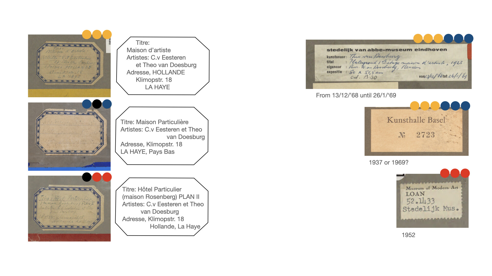
ExpandFig. 37The label types with colour codes for locations on
plans.
Material analysis of the red plans
The plans of
Hôtel Particulier contain
a limited number of labels. The back of the ground-floor plan
(Fig. 26) reveals that it is mounted on strawboard with brown
gummed tape frames that were painted red on the front. In
contrast, the backs of the other two floor plans are mounted
on a board with grey paper that has red frames of glazed paper
overlaid with brown gummed paper (Figs. 27, 28). The ground
floor was remounted at some point on strawboard (the yellowish
board in Fig. 26). On top of the red-glazed paper, the first
and second floor have the same brown gummed paper that can be
found on the ground floor. On the ground floor, a layer of red
paint was added, apparently to mimic the red-glazed paper
(Fig. 38). It is not certain why the brown paper was added
over the red-glazed paper. Since the red paint is also applied
on gummed brown tape, it is possible that the other had not
yet been painted (see Fig. 38).
ExpandFig. 38Floor plans of Hôtel Particulier (Collectie Nieuwe
Instituut/EEST, 3.178; EEST, 3.179; EEST, 3.180) and their
models.
An eight-sided label is present on seven of the nine works
(Figs. 36, 37). The address on the label, “Klimopstraat 18,”
was the residence of Van Doesburg’s second wife, Lena Milius
(1889–1968), from 1920 to 1926.49
Therefore, the floor plans were likely mounted in or before
1923, and the eight-sided label dates from 1923 or 1924 (see
Fig. 36). The strawboard ground floor of
Hôtel Particulier (Fig.
26, 37) lacks the eight-sided label but has a label of the
MoMA exhibition in the top right corner. Also missing the
eight-sided label is the second-floor plan of Maison
Particulière (Fig. 30). However, since the nine works were
made as a set for the 1923 exhibition, the eight-sided label
is likely to have been originally intended for all nine works.
The frames of the red floor plans differ significantly from
the other two sets with their brown paper. This difference
might be rooted in the fact that the Hôtel project ended up in
Van Eesteren’s archive some time after 1924 (Fig. 36).
The backs of the floor plans for
Maison Particulière
(Figs. 29–31) as well as
Maison d’Artiste
(Figs. 32–34) display grey paper similar to that of the first-
and second-floor plans of
Hôtel Particulier,
indicating that this was likely the primary mounting method.
Maison d’Artiste has
the most labels remaining and seems to be the most
consistently mounted overall, featuring only one layer of
yellow-glazed paper. In contrast,
Maison Particulière has
multiple layers of various types of tapes. Labels from the
Kunsthalle Basel and the Van Abbemuseum are only present on
the blue and yellow plans (Fig. 37). Based on the exhibition
records of Het Nieuwe Instituut, the label of the Van
Abbemuseum contains the exhibition dates of December 12,
1968–January 26, 1969, and therefore must be linked to the
exhibition titled Theo van Doesburg: 1883-1931. The
Basel label could be linked to the travelling exhibition
Theo van Doesburg: 1883-1931 that started in the Van
Abbemuseum and was also held in the Kunsthalle Basel
(June-July 1969), but most likely refers to the exhibition
titled Die Konstruktivisten held from January
16-February 14, 1937.50
The MoMA label is dated by HNI to 1952 and therefore must
refer to the De Stijl exhibition of December 16,
1952–February 15, 1953. This label is only present on the
three red floor plans.
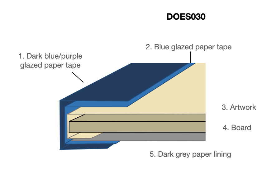
Material analysis of the blue plans
The current ethical standard in paper conservation is to
preserve as much of the existing material as possible. For the
floor plans, the position of RNA’s conservation team was that
elements proven not to be part of the initial design could
only be removed from the object when those elements were seen
to be damaging or potentially damaging the object over time.
Intervention was agreed upon for the ground-floor plan of
Maison Particulière.
This floor plan had previously been lifted from the original
board, and warm animal glue was added on three corners,
resulting in much tension and creasing of the paper substrate.
Since the work had been previously lifted, the sides of the
artwork had already been cut, and a new layer of darker
blue-glazed paper was added. In the treatment, the
conservation team lifted the work again to remove the tension
and to insert an acid-free paper layer between the backboard
and the artwork. The layers of blue-glazed paper were only
consolidated to avoid obscuring the existing layers of glazed
paper.
ExpandFig. 39Floor plans of Maison Particulière (Collectie Nieuwe
Instituut DOES, 030, DOES, 028, DOES, 029) and their
models.
The other two blue-framed floor plans showed more complex
additions on top of the glazed paper, consisting of multiple
layers of pressure-sensitive transparent tape, polyvinyl
chloride tape, and dark blue paint. In this instance, the
conservation team decided to readhere all the layers of
detached pressure-sensitive tape to the frames to preserve the
modifications of the frames made after 1923 (Fig. 39). The
transparent tape seemed to have been added later to re-create
the shine of glazed paper, and as such, it is now part of the
object’s history. The dark blue paint was probably added after
the work was lifted the first time as a way of retouching and
to cover lacunae in the glazed paper-tape frame. A similar
effect was attempted with the PVC tape. but given the fact
that only the first floor has PVC tape with blue paint on top
can indicate that the PVC tape was added in a different
treatment than the blue paint layers. Additionally, only two
of the three were given a new layer of transparent tape,
presumably at a later time than the paint layer (see the
models in Fig. 39).
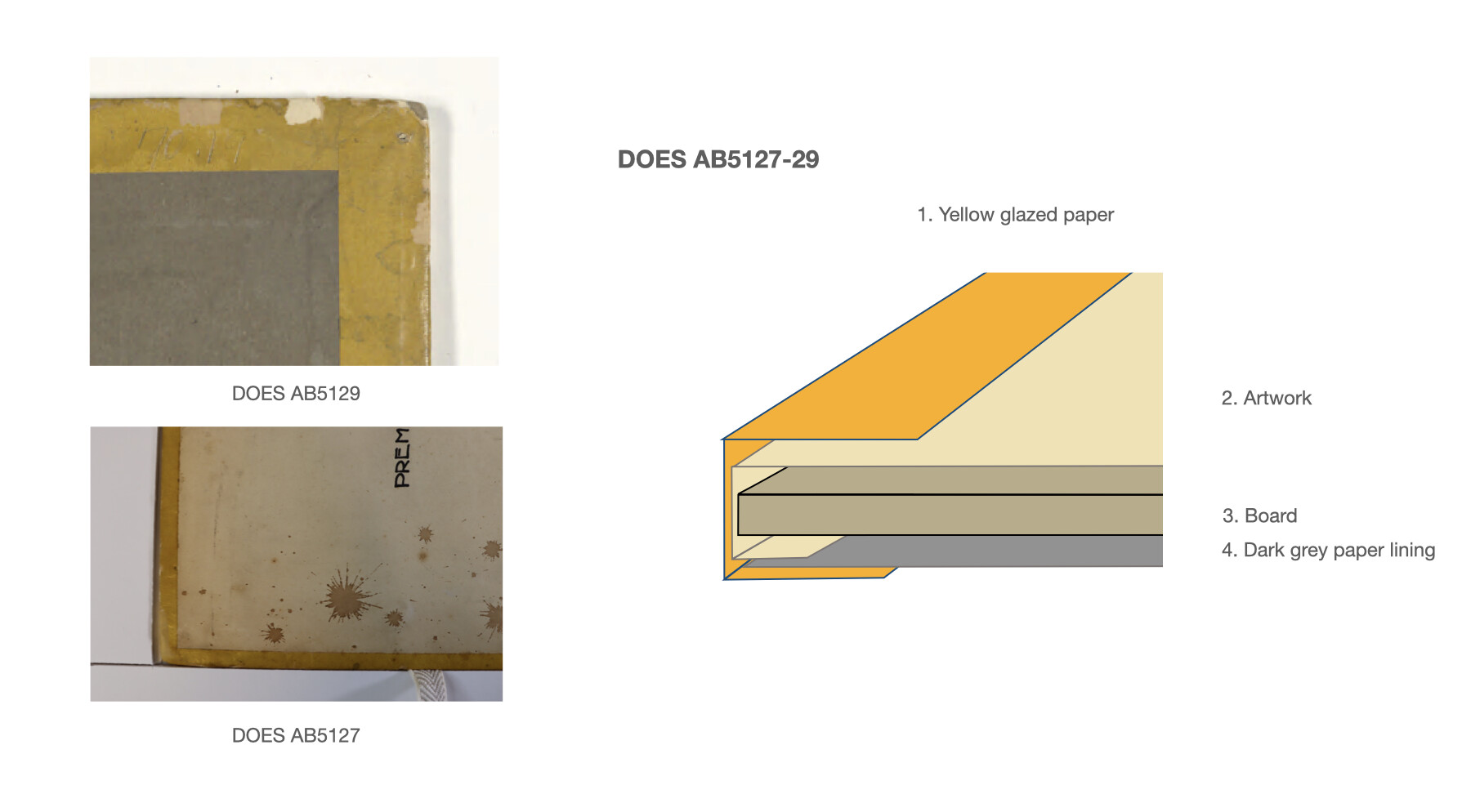
Material analysis of the yellow plans
ExpandFig. 40First- and third-floor plans of Maison d’Artiste
(Collectie Nieuwe Instituut/DOES, AB127; DOES, AB129) and
their model.
The mounting of the three yellow plans of
Maison d’Artiste are
the most contemporary and most intact. By comparing these with
the models of the other six plans, it was determined that the
coloured frames were originally made of glazed paper. The
frames show no significant colour fading from light exposure
when comparing the front and back. The mechanically unaltered
state of the yellow paper frames (Fig. 40) highlights the
extent to which the reds and blues were modified over time.
Furthermore, these unaltered frames support the theory that
the ground-floor plan of
Hôtel Particulier was
remounted at some point and originally had red-glazed paper
frames, as is visible on the backs of the first- and
second-floor plans (Figs. 27, 28). The presence of the MoMA
label on all three plans of
Hôtel Particulier
indicates that the brown gummed tape as well as the strawboard
date from before the MoMA exhibition in 1952. Whether the red
paint dates from that period as well cannot be stated with
certainty.
Conclusion
From the literature and at HNI, it was known that the three
architectural projects discussed above were designed for the
1923 exhibition at Galerie l’Effort Moderne in Paris. Van
Doesburg and Van Eesteren continued to make reproductions of
works for the projects after the exhibition, and it was known
that the floor plans (the collages and their later
reproductions) were part of these projects. It was, however,
unknown that the floor plan collages of the three projects
were designed as a single set for the 1923 exhibition. In
part, this was because the floor plans were never studied
materially, but also because the catalogue raisonné and other
secondary sources confused the later reproductions with the
original collages. Additionally, the coloured edges were never
printed in colour in the secondary literature, and the use of
coloured tape by members of De Stijl as such was not
previously documented. The article establishes the link
between the coloured frames on the floor plans and the
photograph of the 1923 exhibition, and formulates a material
biography of the floor plans. This allows us to date the first
layer of coloured tape and to identify De Stijl’s practice of
using coloured tapes.
The floor plan collages arrived in separate batches at the
conservation studio, and at first sight, the many different
layers of tape and paint on the frames made a chaotic and
incoherent impression. The conservation team discovered,
however, that underneath all the layers there is a consistent
method of mounting. Based on the material homogeneity of the
glazed paper, the mounting techniques, and the address on the
eight-sided label, it was concluded that all nine floor plans
were mounted for the 1923 exhibition. The three projects
designed by Van Doesburg and Van Eesteren—Hôtel Particulier, Maison Particulière,
and
Maison d’Artiste—were central to the exhibition and demonstrated the
integration of architecture and painting, an important concept
within De Stijl. Materially, the floor plans form a set and
tell us the story of Van Doesburg and Van Eesteren’s
partnership for the 1923 exhibition in Paris.
Although Van Doesburg had a conceptual influence on the
designs of the three projects, the material consistency of the
floor plans indicates that they were all created by Van
Eesteren. The floor plans are collages created to be
exhibited. The papers on which the collages are pasted were
made with sufficient margins to be folded around the boards
and adhered to the back. As such, typical reproducible
architectural designs were displayed as works of art with
coloured frames.
Given the significance of the primary colours for Van
Doesburg’s colour theory, the choice for the coloured frames
on the floor plans signifies artistic meaning. On a conceptual
level, the three projects for which the nine designs were made
served as an experiment to integrate the practices of a
painter with those of an architect. They were an artistic
attempt to replace structure in architecture with colour, as
is fully expressed in Van Doesburg’s contra-constructions. The
addition of the frames in red, yellow, and blue to the floor
plans constitutes the first stage of the transformation of Van
Eesteren’s greyscale architectural designs to Van Doesburg’s
colourful artistic designs. However, with this addition of
colour, the floor plans became irreproducible following
traditional architectural practice, as becomes clear in their
photo reproductions—where the coloured frames were no longer
present, offering one explanation for why they have been
overlooked by art historians.
After the 1923 exhibition, the experiment was continued in
publications, reproductions, and discussions but never
finished. Van Doesburg and Van Eesteren operated in a grey
area between works of art and designs for construction. The
many materials and techniques they used for the original floor
plans and their reproductions created tension between colour
and structure and between singularity and (mass) reproduction.
Because these buildings remained unexecuted, the envisioned
synthesis draws even greater attention to the experimental
element of the process. With regard to these works by Van
Doesburg and Van Eesteren, the question recurs: Can painting
and colour actually be integrated with architecture, or is it
rather an indication of the constraints that result in a
rational division of labour?
As for the conservation dilemma that started this
investigation, the RNA team decided to readhere the
transparent tapes as well as the PVC tape. The modifications
of the layers of tape that have been added over time show that
the coloured frames have had a significant impact on the
beholders of the designs—and continue to do so. The material
analysis of the coloured frames of the nine floor plans from
the conservator’s perspective has proved essential in
unravelling the historical context in which the plans were
made and circulated in the years after their creation.
Acknowledgements
I am grateful to Elza van den Berg and Huub Breuer from Het
Nieuwe Instituut for providing all the archival records and
images that were required for this research. Without their
enthusiasm and optimism, this paper would not have been
realised. I would also like to thank Sjoerd van Faassen for
providing access to his transcriptions of Van Doesburg and Van
Eesteren’s letters. Many thanks to my colleagues Elizabet
Nijhoff Asser and Herre de Vries for all their support.
Finally, I extend my gratitude to the Materia team
for their thorough peer review and editing.
Bibliography
Bock, Manfred. “Cornelis van Eesteren.” In
De vervolgjaren van De Stijl, 1922–1934, edited by
Carel Blotkamp, 241–94. Amsterdam: L. J. Veen, 1996.
Broekhuizen, Dolf. “True-to-Life Experiences: Initiatives for
Model Homes and Reconstructions.” In Maison d’Artiste: Unfinished Icon by De Stijl Icon, edited by Dolf Broekhuizen, 25–34. Rotterdam: nai010, 2016.
Broekhuizen, Dolf. “Interpreting the Maison d’Artiste:
Historiography of a Design.” In Maison d’Artiste: Unfinished De Stijl Icon, edited by Dolf Broekhuizen, 53–88. Rotterdam: nai010, 2016.
Hoek, Els, ed. Theo van Doesburg: Oeuvre catalogus.
Bussum: Thoth, 2000.
Somer, Kees. “We worked evermore fully together’: Van Eesteren
en de ‘collective construction.” in Maison d’Artiste: Unfinished De Stijl Icon, edited by Dolf Broekhuizen, 43–52. Rotterdam: nai010, 2016.
Theo van Doesburg: 1883-1931 ; Stedelijk van Abbemuseum
Eindhoven, 13 december 1968 tm 26 januari 1996,
Gemeentemuseum Den Haag, 7 februari tm 23 maart 1969,
Kunsthalle Basel, Juni/Juli 1969.
S.l.: Stedelijk Van Abbemuseum, 1968.
Van Doesburg, Theo. “De betekenis van kleur in binnen-
buitenarchitectuur.” Bouwkundig Weekblad 44 (1923):
234–32.
Van Faassen, Sjoerd, and Herman van Bergeijk. ‘Onze pénétratie was sterker als jij in je laatste brief
vermoedt’: De briefwisseling tussen Theo van Doesburg en Cornelis
van Eesteren, 1922–1931.
N.p.: Rode Haring, 2022.
Van Faassen, Sjoerd, and Herman van Bergeijk.
De kleur lost de architectonische ruimte op: de
briefwisseling tussen Theo van Doesburg en architect C.R. de
Boer, 1920-1929.
Haarlem: Uitgeverij Eigenbouwer, 2019.
Van Faassen, Sjoerd, and Hans Renders.
Ik sta helemaal alleen: Biografie Theo van Doesburg.
Amsterdam: De Bezige Bij, 2022.
Van Moorsel, Wies.
Nelly van Doesburg, 1899–1975. Nijmegen: SUN, 2000.
Van Straaten, Evert.
Theo van Doesburg, Schilder en Architect. Den Haag:
Sdu, 1988.
Archival Sources
Manifesto V of De Stijl, Collectie Nieuwe Instituut/EEST,
3.360.
Documenten betreffende de Stijl-tentoonstelling, Parijs 1923,
Collectie Nieuwe Instituut EEST, 3.360.
Collectie Nieuwe Instituut/EEST, 3.364; and AB5343.
All figures of the works listed below are with courtesy from
Archive Het Nieuwe Instituut, Rotterdam[Archive Het Nieuwe Instituut, Rotterdam](https://zoeken.nieuweinstituut.nl/en/)
EEST, 3.360n1
EEST, 3.178-3.181
EEST, 11n4
DOES, 028-030
DOES, AB126-129
DOES, AB5302+
DOES, AB5115
DOES, AB5117
DOES, AB5125
Figures 2-4, 18, 19, and 23 are photographs by RNA -
restauratie nijhoff asser.
Notes
The article is based on a presentation delivered at the
Architectuur Dichterbij Conference, Het Nieuwe
Instituut, Rotterdam, November 2, 2022.
Evert van Straaten,
Theo van Doesburg, Schilder en Architect (Den
Haag: Sdu,1988), 108, 115, 138.
↩︎
Theo van Doesburg to Cornelis van Eesteren, [late
January 1923], in Sjoerd van Faassen and Herman van
Bergeijk,
‘Onze pénétratie was sterker als jij in je laatste
brief vermoedt’: De briefwisseling tussen Theo van Doesburg en
Cornelis van Eesteren, 1922–1931
(n.p.: Rode Haring, 2022), letter 5.
↩︎
Manfred Bock, “Cornelis van Eesteren,” in
De vervolgjaren van De Stijl, 1922–1934, ed.
Carel Blotkamp (Amsterdam: L. J. Veen, 1996), 248,
252–53.
↩︎
Van Doesburg to Van Eesteren, [Weimar, early July 1922],
in Van Faassen and Van Bergeijk,
‘Onze pénétratie was sterker als jij in je laatste
brief vermoed,’
letter 1; Bock, “Cornelis van Eesteren,” 252. All
translations are mine unless otherwise noted.
↩︎
Manifesto V of De Stijl, Collectie Nieuwe
Instituut/EEST, 3.360; Sjoerd van Faassen and Hans
Renders,
Ik sta helemaal alleen: Biografie Theo van
Doesburg
(Amsterdam: De Bezige Bij, 2022), 440–43.
↩︎
For an overview of most of the designs for these
projects, see
Theo van Doesburg: Oeuvre catalogus, ed. Els
Hoek (Bussum: Thoth, 2000), 343–70 (cited hereafter as
Oeuvre catalogus).
↩︎
Also see Van Doesburg to Anthony Kok, October 18, 1923,
as cited by Bock, “Cornelis van Eesteren,” 257; and Van
Straaten, Theo van Doesburg, 111.
↩︎
Van Faassen and Renders, Ik sta helemaal alleen,
246. ↩︎
Van Faassen and Renders,
Ik sta helemaal alleen, 246. Van Doesburg’s
Beeldende Constructie-leer and other theories
are listed in note 114.
↩︎
Bock, “Cornelis van Eesteren,” 250–52; ‘Theo van
Doesburg to Cornelis van Eesteren, [early July 1922]
(see note 7 above); Van Faassen and Renders,
Ik sta helemaal alleen, 436, 441–43.
↩︎
For a floor plan of the exhibition and list of the works
displayed, see Documenten betreffende de
Stijl-tentoonstelling, Parijs 1923, Collectie Nieuwe
Instituut/EEST, 3.360.
↩︎
Van Faassen and Renders,
Ik sta helemaal alleen, 440.
↩︎
Bock, “Cornelis van Eesteren,” 261; Van Doesburg to Van
Eesteren, Clamart, September 2, 1924, in Van Faassen en
Van Bergeijk, ‘Onze pénétratie was sterker als jij in je laatste
brief vermoedt,’ letter 46.
↩︎
Van Straaten, Theo van Doesburg, 111; Van
Doesburg to Van Eesteren, Clamart, August 12, 1924 (see
note 19 above).
↩︎
For an interpretation of the architectural principles,
see Bock, “Cornelis van Eesteren,” 263.
↩︎
Van Straaten, Theo van Doesburg, 115; Bock,
“Cornelis van Eesteren,” 258.
↩︎
Kees Somer, “‘We worked evermore fully together’: Van
Eesteren en de ‘collective construction’,” in
Maison d’Artiste: Unfinished De Stijl Icon, ed. Dolf Broekhuizen (Rotterdam: nai010, 2016), 43.
↩︎
Collectie Nieuwe Instituut/EEST, 3.364 and AB5343.
↩︎
For an overview of the debate on authorship, see Bock,
253–58, 270; Van Faassen and Van Bergeijk, ‘Onze pénétratie was sterker als jij in je laatste
brief vermoedt, 17–19; and Van Doesburg to Van Eesteren, Clamart,
August 12 1924, letter 44.
↩︎
Van Doesburg to Van Eesteren, August 12, 1924, as quoted
in Van Faassen and Van Bergeijk, ‘Onze pénétratie was sterker als jij in je laatste
brief vermoedt, 135; Van Faassen and Renders,
Ik sta helemaal alleen, 432–35.
↩︎
From 1920 to 1922, Van Doesburg worked together with the
architect Cornelis Rienks de Boer (1881-1966) a row of
sixteen small family houses in the Dutch town of
Drachten. Van Faassen and Renders,
Ik sta helemaal alleen, 234-46; see also Sjoerd
van Faassen and Herman van Bergeijk,
De kleur lost de architectonische ruimte op: de
briefwisseling tussen Theo van Doesburg en architect
C.R. de Boer, 1920-1929, Haarlem: Uitgeverij Eigenbouwer, 2019.
↩︎
Van Faassen and Renders,
Ik sta helemaal alleen, 248.
↩︎
The archive of Van Eesteren (Collectie Nieuwe
Instituut/EEST, 3.360, Documenten betreffende de
Stijl-tentoonstelling, Parijs 1923) includes a list of
the costs of the exhibition drawn up by Van Eesteren.
↩︎
Van Faassen and Renders,
Ik sta helemaal alleen, 440; Bock, “Cornelis
van Eesteren,” 223.
↩︎
On the importance of Nelly van Moorsel for Theo van
Doesburg, see Wies van Moorsel,
Nelly van Doesburg, 1899–1975 (Nijmegen: SUN,
2000).
↩︎
On the invoice from the photo company Paul Lemare, see
Documenten betreffende de Stijl-tentoonstelling, Parijs
1923, Collectie Nieuwe Instituut/EEST, 3.360.
↩︎
Nelly van Moorsel and Van Doesburg to Van Eesteren,
Weimar, November 23, 1923, in Van Faassen and Van
Bergeijk, ‘Onze pénétratie was sterker als jij in je laatste
brief vermoedt’, letter 9; and an agitated letter from Van Eesteren
to Van Doesburg, March 2, 1924, Documenten betreffende
de Stijl-tentoonstelling, Parijs 1923.
↩︎
Nelly van Moorsel and Van Doesburg to Van Eesteren,
Weimar, November 23, 1923, in Van Faassen and Van
Bergeijk, ‘Onze pénétratie was sterker als jij in je laatste
brief vermoedt’, letter 9;
↩︎
The designs for the hall at the University of Amsterdam
were also on display at the 1923 exhibition.
↩︎
Nelly van Moorsel and Van Doesburg to Van Eesteren,
Weimar, November 23, 1923, in Van Faassen and Van
Bergeijk, ‘Onze pénétratie was sterker als jij in je laatste
brief vermoedt’, letter 9;
↩︎
Dolf Broekhuizen, “Interpreting the Maison d’Artiste:
Historiography of a Design,” in Broekhuizen,
Maison d’Artiste, 60, images 52 and
53. See Hoek, Oeuvre catalogus, for an
extensive overview of the various reproductions of the
artworks; and van Doesburg to van Eesteren, [late
January 1923] (see note 4 above).
↩︎
“De schilderkunst moet de bouwkunst de weg wijzen . . .
. De kleur maakt de ruimtelijke werking, die de
architect nastreeft, zichtbaar. Op deze wijze voltooit
kleur de architectuur.” Theo van Doesburg, “De betekenis
van kleur in binnen- buitenarchitectuur,”
Bouwkundig Weekblad 44 (1923): 234–32, as cited
in Bock, “Cornelis van Eesteren,” 258.
↩︎
For a picture of the exhibition “Theo van Doesburg” in
Van Abbe Museum (December 13, 1968 – January 26, 1969),
see Dolf Broekhuizen, “True-to-Life Experiences:
Initiatives for Model Homes and Reconstructions,” in
Broekhuizen, Maison d’Artiste, 29.
↩︎
Broekhuizen and Hoek are taken here as recent examples,
but the confusion reaches back to earlier publications.
See, for example, Bock, “Cornelis van Eesteren,” 260,
264, 271; and Van Straaten, Theo van Doesburg,
112, 115.
↩︎
Broekhuizen, “Interpreting the Maison d’Artiste,” 70,
and the historic photo reproduction on 83.
↩︎
Lena Milius was administrator for De Stijl, and the
building she lived in was part of the complex “Berg en
Daal,” designed by Stijl member Jan Wils (1891–1972).
Van Doesburg to Van Eesteren [late January 1923], in Van
Faassen and Van Bergeijk, ‘Onze pénétratie was sterker als jij in je laatste
brief vermoedt, letter 5, nn3–4.
↩︎
Theo van Doesburg: 1883-1931 ; Stedelijk van
Abbemuseum Eindhoven, 13 december 1968 tm 26 januari
1996, Gemeentemuseum Den Haag, 7 februari tm 23 maart
1969, Kunsthalle Basel, Juni/Juli 1969. S.l.: Stedelijk Van Abbemuseum, 1968.
↩︎
Fig. 1Photo of the exhibition De Stijl, Galerie l’Effort
Moderne, Paris 1923. On the wall, the floor plans of the
ground floor and first floor of Hôtel Particulier are visible
(Collectie Nieuwe Instituut/EEST, 3.360n1).
Fig. 2Detail of the red-painted tape on the ground-floor plan of
Hôtel Particulier, 1923 (Collectie Nieuwe Instituut/EEST,
3.178). Photo by RNA.
Fig. 3Detail of the transparent pressure-sensitive tape and
blue-coloured paint on the blue-glazed paper on the
second-floor plan of Maison Particulière, 1923 (Collectie
Nieuwe Instituut/DOES, 029). Photo by RNA.
Fig. 4Detail of the yellow-glazed paper on the first-floor plan of
Maison d’Artiste, 1923 (Collectie Nieuwe Instituut/DOES,
AB5127). Photo by RNA.
Fig. 5Cornelis van Eesteren (left) and Theo van Doesburg (right)
with their maquette of Maison Particulière in their studio,
1923 (Collectie Nieuwe Instituut/DOES, AB5302+). Photographer
unknown.
Fig. 6The first-stage architectural design: the ground-floor plan
of Maison Particulière, 1923 (Collectie Nieuwe Instituut/DOES,
030) and the axonometric projection of Maison Particulière
from the southwest, 1923 (Collectie Nieuwe Instituut/ DOES,
AB5115).
Fig. 7The first-stage architectural design: the ground-floor plan
of Maison Particulière, 1923 (Collectie Nieuwe Instituut/DOES,
030) and the axonometric projection of Maison Particulière
from the southwest, 1923 (Collectie Nieuwe Instituut/ DOES,
AB5115).
Fig. 8Second-stage colour analysis: colour analysis on the
axonometric projection of Maison Particulière from the
northwest (Collectie Nieuwe Instituut/EEST, 3.181) and
contra-construction of Maison Particulière from the southwest,
1923 (DOES, AB5117).
Fig. 9Second-stage colour analysis: colour analysis on the
axonometric projection of Maison Particulière from the
northwest (Collectie Nieuwe Instituut/EEST, 3.181) and
contra-construction of Maison Particulière from the southwest,
1923 (DOES, AB5117).
Fig. 10Third-stage synthesis: photo of the maquette of Maison
Particulière from the southeast. Photographer unknown, 1923
(Collectie Nieuwe Instituut/ DOES, AB5125).
Fig. 11Plans for the ground (Collectie Nieuwe Instituut/EEST,
3.178), first (EEST, 3.179), and second (EEST, 3.180) floors
of Hôtel Particulier, 1923.
Fig. 12Plans for the ground (Collectie Nieuwe Instituut/EEST,
3.178), first (EEST, 3.179), and second (EEST, 3.180) floors
of Hôtel Particulier, 1923.
Fig. 13Plans for the ground (Collectie Nieuwe Instituut/EEST,
3.178), first (EEST, 3.179), and second (EEST, 3.180) floors
of Hôtel Particulier, 1923.
Fig. 14Detail of the tapes and drop marks in the top right corner of
the second-floor plan of Hôtel Particulier, 1923 (Collectie
Nieuwe Instituut/EEST, 3.180).
Fig. 15Plans for the first (Collectie Nieuwe Instituut/DOES, 028),
second (DOES, 029), and ground (DOES, 030) floors of Maison
Particulière, 1923.
Fig. 16Plans for the first (Collectie Nieuwe Instituut/DOES, 028),
second (DOES, 029), and ground (DOES, 030) floors of Maison
Particulière, 1923.
Fig. 17Plans for the first (Collectie Nieuwe Instituut/DOES, 028),
second (DOES, 029), and ground (DOES, 030) floors of Maison
Particulière, 1923.
Fig. 18Detail showing PVC tape on the first-floor plan (Collectie
Nieuwe Instituut/DOES, 028), and detail of glazed paper with
transparent pressure-sensitive tapes on the second-floor plan
(DOES, 029) , 1923. Photos by RNA.
Fig. 19Detail showing PVC tape on the first-floor plan (Collectie
Nieuwe Instituut/DOES, 028), and detail of glazed paper with
transparent pressure-sensitive tapes on the second-floor plan
(DOES, 029) , 1923. Photos by RNA.
Fig. 20Plans for the first (Collectie Nieuwe Instituut/DOES,
AB5127), second (DOES, AB5128), and third (DOES, AB5129)
floors of Maison d’Artiste, 1923.
Fig. 21Plans for the first (Collectie Nieuwe Instituut/DOES,
AB5127), second (DOES, AB5128), and third (DOES, AB5129)
floors of Maison d’Artiste, 1923.
Fig. 22Plans for the first (Collectie Nieuwe Instituut/DOES,
AB5127), second (DOES, AB5128), and third (DOES, AB5129)
floors of Maison d’Artiste, 1923.
Fig. 23Detail of stains and spots on the first-floor plan of Maison
d’Artiste (Collectie Nieuwe Instituut/DOES, AB5127), 1923.
Photo by RNA.
Fig. 24Glass-plate negative of Maison Particulière made by Paul
Lemare with retouches in black paper tape (here showing in
white) by Van Doesburg, 1923 (Collectie Nieuwe Instituut. EEST
11n4). “The light of the reflector is too strong, thereby
showing all the flaws of the model. . . . Who photographs a
model on a pedestal! Blöd!”
Fig. 25Photo reproduction of the ground-floor plan of Maison
d’Artiste (Collectie Nieuwe Instituut/DOES, AB5126) after
1923. The original collage has been lost.
Fig. 26Verso of the ground-floor plan, Hôtel Particulier (Collectie
Nieuwe Instituut/EEST, 3.178),
Fig. 27Verso of the first-floor plan, Hôtel Particulier (EEST,
3.179).
Fig. 28Verso of the second-floor plan, Hôtel Particulier (EEST,
3.180).
Fig. 29Verso of the first-floor plan, Maison Particulière (DOES,
028).
Fig. 30Verso of the second-floor plan, Maison Particulière (DOES,
029).
Fig. 31Verso of the ground-floor plan, Maison Particulière (DOES,
030).
Fig. 32Verso of the first-floor plan, Maison d’Artiste (DOES,
AB5127).
Fig. 33Verso of the second-floor plan, Maison d’Artiste (DOES,
AB5128).
Fig. 34Verso of the third-floor, plan Maison d’Artiste (DOES,
AB5129).
Fig. 35Detail of the photo of the exhibition De Stijl,
Galerie l’Effort Moderne, Paris 1923 (Collectie Nieuwe
Instituut/EEST, 3.360n1) (fig. 1). Note the red frames on the
ground- and first-floor plans (EEST, 3.178; EEST, 3.179). In
the front is the maquette of Maison d’Artiste.
Fig. 36Exhibition timeline and labels.
Fig. 37The label types with colour codes for locations on plans.
Fig. 38Floor plans of Hôtel Particulier (Collectie Nieuwe
Instituut/EEST, 3.178; EEST, 3.179; EEST, 3.180) and their
models.
Fig. 39Floor plans of Maison Particulière (Collectie Nieuwe
Instituut DOES, 030, DOES, 028, DOES, 029) and their models.
Fig. 40First- and third-floor plans of Maison d’Artiste (Collectie
Nieuwe Instituut/DOES, AB127; DOES, AB129) and their model.